Introduction
This is a book about using data in journalism, but it’s not a particularly practical book. Instead it’s for the curious, for those who wonder about the deep ideas that hold everything together. Some of these ideas are very old, some have emerged in just the last few decades, and many of them have come together to create the particularly twenty-first-century practice of data journalism.
We’ll cover some of the mathy parts of statistics, but also the difficulty of taking a census of race and the cognitive psychology of probabilities. We’ll trace where data comes from, what journalists do with it, and where it goes after—and try to understand the possibilities and limitations. Data journalism is as interdisciplinary as it gets, which can make it difficult to assemble all the pieces you need. This is one attempt.
There are few equations and no code in this book, and I don’t assume you know anything about math. But I am assuming you want to know, so I’m going to develop some key ideas from the ground up. Or maybe you’ve studied a technical field and you are just coming into journalism, in which case I hope this book helps you understand how your skills apply. This is a framework, a collection of big ideas journalists can steal from other fields. I want to give a foothold into statistical analysis in all its nerdy splendor, but equally show how ethnography can help you interpret crime figures.
We’re going to look at data a lot more closely than you might be used to. Consider this graph of the U.S. unemployment rate over the last 10 years. There is a whole world just beneath the surface of this image.
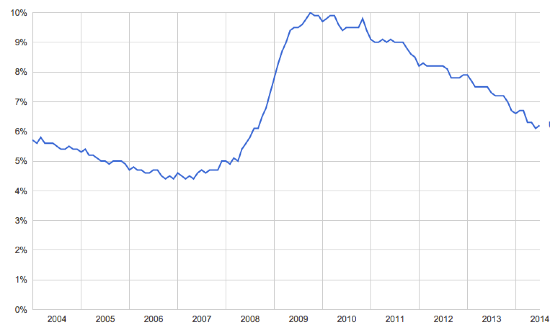
From the U.S. Bureau of Labor Statistics.
It’s clear that a lot of people lost their jobs after the 2008 financial crash. You can read this chart and say how many: The unemployment rate went up by 5 percent. This is a very ordinary, very reasonable way of talking about this data, exactly the sort of thing that should pop into your head when you see this image. We’re going to look deeper.
Where did these numbers come from? What do they actually count? What can the journalist say about this data, in light of recent history? What should the audience do after seeing it? Why do we believe charts like this, and should we? How is an unemployment chart any better, or different, than just asking people about their post-crash lives?
What’s the data really doing for us here?
This book is about bringing the quantitative tradition into journalism. Data is not just numbers, but numbers were the first form of data. The very first writing systems were used for accounting, long before they were sophisticated enough for language.1 At that time the rules of addition must have seemed incredibly arcane (in base 60, at first!), and it must have been a powerful trick to be able to tell in advance how many stones you would need for a building of a certain size. There is no doubt that numbers, like words, are a type of practical magic, and counting is the foundation of data work to this day. But you already know how to count. So we’re mostly going to talk about ideas that were developed during The Enlightenment, then massively refined and expanded in the twentieth century with modern statistics and computers.
We’ll need to go well outside of statistics to make any sense of things. I’ve been raiding psychology and social science and ethnography, and further places too like intelligence analysis and the neurobiology of vision. I’ve been collecting pieces, hoping to use data more thoughtfully and effectively in my journalism work. I’ve tried to organize the things that can be said into three parts: Quantification is what makes data, then the journalist analyzes it, then the result is communicated to the audience. This process creates “stories,” the central products of journalism.
In journalism, a story is a narrative that is not only true but interesting and relevant to the intended audience. Data journalism is different from pure statistical analysis—if there is such a thing—because we need culture, law, and politics to tell us what data matters and how. A procurement database may tell us that the city councilor has been handing out lucrative contracts to his brother. But this is interesting only if we understand this sort of thing as “corruption” and we’ve decided to look for it. A sports journalist might look for entirely different stories in the same data, such as whether or not the city is actually going to build that proposed new stadium. The data alone doesn’t determine the story. But the story still has to be true, and hopefully also thorough and fair. What exactly that means isn’t always obvious. The relationship between story, data, culture, and truth is one of the key problems of twenty-first-century journalism.i
The process of quantification, analysis, and communication is a cycle. After communicating a result you may realize that you want a different analysis of the same data, or different data entirely. You might end up repeating this process many times before anything is ever published, exploring the data and communicating primarily to yourself and your colleagues to find and shape the story. Or these steps might happen for each of many stories in a long series, with feedback from the audience directing the course of your reporting. And somewhere, at some point, the audience acts on what you have communicated. Otherwise, journalism would have no effect at all.
Data begins with quantification. Data is not something that exists in nature, and unemployed people are a very different thing than unemployment data. What is counted and how?
There are at least six different ways that the U.S. government counts who is unemployed, which give rise to data sets labeled U1 to U6.2 The official unemployment rate— the government calls one of them “official”—is known as U3. But U3 does not count people who gave up looking for a job, as U4 does, or people who hold part-time jobs because they can’t get a full-time job, as U6 does.
And this says nothing about how these statistics are actually tabulated. No one goes around asking every single American about their employment status every single month. The official numbers are not “raw” counts but must be derived from other data in a vast and sophisticated ongoing estimation process based on random sampling. Unemployment figures, being estimates, have statistical estimation error—far more error than generally realized. This makes most stories about short-term increases or decreases irrelevant.3
There is a complex relationship between the idea conveyed by the words “unemployment rate” and the process that produces a particular set of numbers. Normally all of this is backstage, hidden behind the chart. it’s the same for any other data. Data is created. It is a record, a document, an artifact, dripping with meaning and circumstance. A machine recorded a number at some point on some medium, or a particular human on a particular day made a judgment that some aspect of the world was this and not that, and marked a 0 or a 1. Even before that, someone had to decide that some sort of information was worth recording, had to conceive of the categories and meanings and ways of measurement, and had to set up the whole apparatus of data production.ii
Data production is an elaborate process involving humans, machines, ideas, and reality. It is social, physical, and specific to time and place. I’m going to call this whole process “quantification,” a word which I’ll use to include everything from dreaming up what should be counted to wiring up sensors.
If quantification turns the world into data, analysis tells us what the data means. Here is where journalism leans most heavily on traditional mathematical statistics. If you’ve found statistics difficult to learn, it’s not your fault. It has been terribly taught.4 Yet the underlying ideas are beautiful and sensible. These foundational principles lead to certain rules that guide our search for truth, and we want those rules. It is hard to forgive arithmetic errors or a reporter’s confused causality. Journalism can demand deep and specific technical knowledge. It’s no place for people who want to avoid math.
Suppose you want to know if the unemployment rate is affected by, say, tax policy. You might compare the unemployment rates of countries with different tax rates. The logic here is sound, but a simple comparison is wrong. A great many things can and do affect the unemployment rate, so it’s difficult to isolate just the effect of taxes. Even so, you can build statistical models to help you guess what the unemployment rate would have been if all factors other than tax policy were the same between countries. We’re now talking about imaginary worlds, derived from the real through force of logic. That’s a tricky thing—not always possible, and not always defensible even when formally possible. But we do have hundreds of years of guidance to help us.
Journalists are not economists, of course. They’re not really specialists of any kind, especially if journalism is all they have studied and practiced. We already have economists, epidemiologists, criminologists, climatologists, and on and on. But journalists need to understand the methods of any field they touch, or they will be unable to tell good work from bad. They won’t know which analyses are worth repeating. Even worse, they will not understand which data matters. And, increasingly, journalists are attempting their own analyses when they discover that the knowledge they want does not yet exist. Journalists aren’t scientists, but they need to understand what science knows about evidence and inference.
There are few outright equations in this book, but it is a technical book. I use standard statistical language and try to describe concepts faithfully but mostly skip the formal details. Whenever you see a word in italics that means you can go look it up elsewhere. Each technical term is a gateway to whole worlds of specialized knowledge. I hope this book gives you a high-level view of how statistical theory is put together, so you’ll know what you’re trying to do and where you might look for the appropriate pieces.
After analysis comes communication. This makes journalism different from scholarship or science, or any field that produces knowledge but doesn’t feel the compulsion to tell the public about it in an understandable way. Journalism is for the audience—which is often a very broad audience, potentially millions of people.
Communication depends on human culture and cognition. A story includes an unemployment chart because it’s a better way of communicating changes in the unemployment rate than a table of numbers, which is true because human eyes and brains process visual information in a certain way. Your visual system is attuned to the orientation of lines, which allows you to perceive trends without conscious effort. This is a remarkable fact which makes data visualization possible! And it shows that data journalists need to understand quantitative cognition if they want to communicate effectively.
From experience and experiments we know quite a lot about how minds work with data. Raw numbers are difficult to interpret without comparisons, which leads to all sorts of normalization formulas. Variation tends to get collapsed into stereotypes, and uncertainty tends to be ignored as we look for patterns and simplifications. Risk is personal and subjective, but there are sensible ways to compare and communicate odds.
But more than these technical concerns is the question of what is being said about whom. Journalism is supposed to reflect society back to itself, but who is the “we” in the data? Certain people are excluded from any count, and astonishing variation is abstracted into uniformity. The unemployment rate reduces each voice to a single bit: are you looking for work, yes/no? A vast social media data set seems like it ought to tell us deep truths about society, but it cannot say anything about the people who don’t post, or the things they don’t post about. Omniscience sounds fantastic, but data is a map and not the territory.
And then there’s the audience. What someone understands when they look at the data depends on what they already believe. If you aren’t unemployed yourself, you have to rely on some image of “unemployed person” to bring meaning to the idea of an unemployment rate. That image may be positive or negative, it may be justified or untrue, but you have to fill in the idea of unemployment with something to make any sense at all of unemployment statistics. Data can demolish or reinforce stereotypes, so it’s important for the journalist to be aware that these stereotypes are in play. That is one reason why it’s not enough for data to be presented “accurately.” We have to ask what the recipient will end up believing about the world, and about the people represented by the data. Often, data is best communicated by connecting it to stories from the individual lives it represents.
We’re not quite done. I want action. Someone eventually has to act on what they’ve learned if journalism is going to mean anything at all, and action is a powerfully clarifying perspective. Knowing the unemployment rate is interesting. Much better is knowing that a specific plan would plausibly create jobs. This sort of deep research will usually be done by specialists, but journalists have to understand enough to act as a communicator and an independent check. As a media professional, a journalist has both the power and responsibility to decide what is worth repeating.
Data cannot tell us what to do, but it can sometimes tell us about consequences. The twentieth century saw great advances in our understanding of causality and prediction. But prediction is very hard. Most things can’t be predicted well, for fundamental reasons such as lack of data, intrinsic randomness, free will, or the butterfly effect. These are profound limits to what we can know about the future. Yet where prediction is possible, there is convincing evidence that data is essential. Purely qualitative methods, no matter how sophisticated, just don’t seem to be as accurate. Statistical methods are essential for journalism that asks what will happen, what should be done, or how best to do it.
This doesn’t mean we can just run the equations forward and read off what to do. We’ve seen that dream before. At an individual level, the ancient desire for universal quantification can be a source of mathematical inspiration. Leibniz dreamed of an unambiguous language of “universal character.” Three centuries later, the failure of the symbolic logic paradigm in artificial intelligence finally showed how impractical that is, but the exercise was enormously productive. The desire for universal quantification hasn’t worked out quite so well at a societal level. Every authoritarian planner dreams of utopia, but totalitarian technocratic visions have been uniformly disastrous for the people living in them. A fully quantified social order is an insult to freedom, and there are good reasons to suspect such systems will always be defeated by their rigidity.5 Questions of action can hone and refine data work, but actual action—making a choice and doing—requires practical knowledge, wisdom, and creativity. The use of statistics in journalism, like the use of statistics in general, will always involve artistry.
All of this is implicit in every use of data in journalism. All of it is just below the surface of an unemployment chart in the news, to say nothing of the dazzling visualizations that journalists now create. Journalism depends on what we have decided to count, the techniques used to interpret those counts, how we decide to show the results, and what happens after we do. And then the world changes, and we report again.