Communicating Uncertainty
Uncertainty is a recurring theme in data work. It’s familiar in a way, because we have all been unsure. But I don’t think most people have a natural feel for quantitative measures of uncertainty. I suspect the best way to get a feel for uncertainty is to play with simulations of probabilistic things, but your readers won’t have done that so we have to find other ways of communicating.
We’ve encountered quantified uncertainty many times already. The simplest way of presenting uncertainty is to give a range: 312 ±7 miles. The margin of error of a sample is a more sophisticated measure that includes how often we expect the error to fall in that range: the poll numbers were 68 percent in favor, accurate to within 3 percent 19 times out of 20. Probabilities are also a kind of uncertainty: we analyzed the stoplight data and found that the odds were 2 to 1 in favor of the model with a working stoplight.
These sorts of numbers can be difficult to grasp on an intuitive level, yet the uncertainty in a result is a key part of that result. When the data is uncertain or leads to uncertain conclusions, it would be a lie to omit that uncertainty, or communicate it poorly.
There are many ways to communicate uncertainty. We can show it in a visualization by indicating the range of possible values.
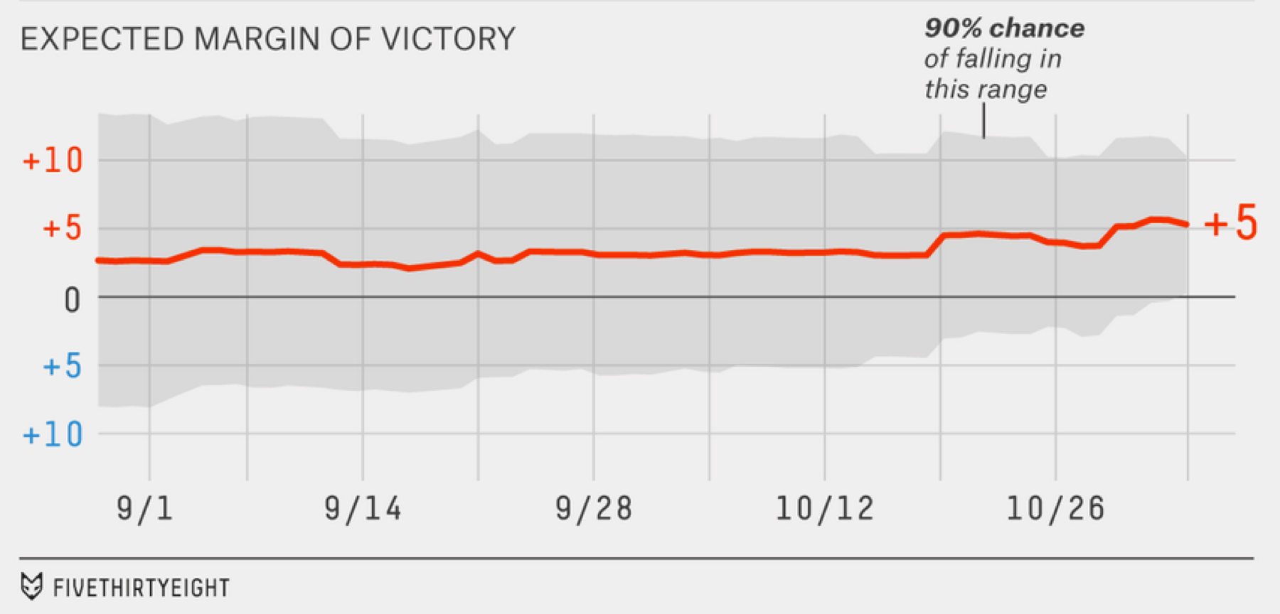
Expected margin of victory in 2014 elections, from fivethirtyeight.com.70
This image from the 2014 elections shows how the margin of error on the margin of victory changed over time.xxvi It clarifies something which is not otherwise obvious: The polls showed a consistent lead for months, yet it was only late in the race that victory was particularly certain. All through September the odds were closer to 60/40, only narrowing substantially in the second half of October.
The gray region is the range of values where the outcome is expected to fall 90 percent of the time, the 90-percent confidence interval. The easiest way to compute this range is to simulate lots and lots of elections using a model that generates random outcomes according to the known uncertainty of the polling data, then find the 5th and 95th percentiles to cut off the outliers on the bottom and top. The 90 percent figure is arbitrary, really just convention, but it provides a reasonable balance. If we showed the entire 100 percent range of the data, the gray region would stretch to include every fluke scenario. If we showed only the central 50 percent then readers might come away with an overly narrow impression of the uncertainty, because the true result would fall outside the gray area half the time (assuming a properly calibrated prediction model).
We can also show uncertainty by presenting the results of simulations with randomness built in. The New York Times built a roulette machine to explain the uncertainties in its 2014 election predictions. Each state is represented by a wheel divided into colored segments according to the then-current probabilities that each party would win there. When the user clicks the spin button, all wheels spin and stop and at random positions, producing a final tally of senate seats.
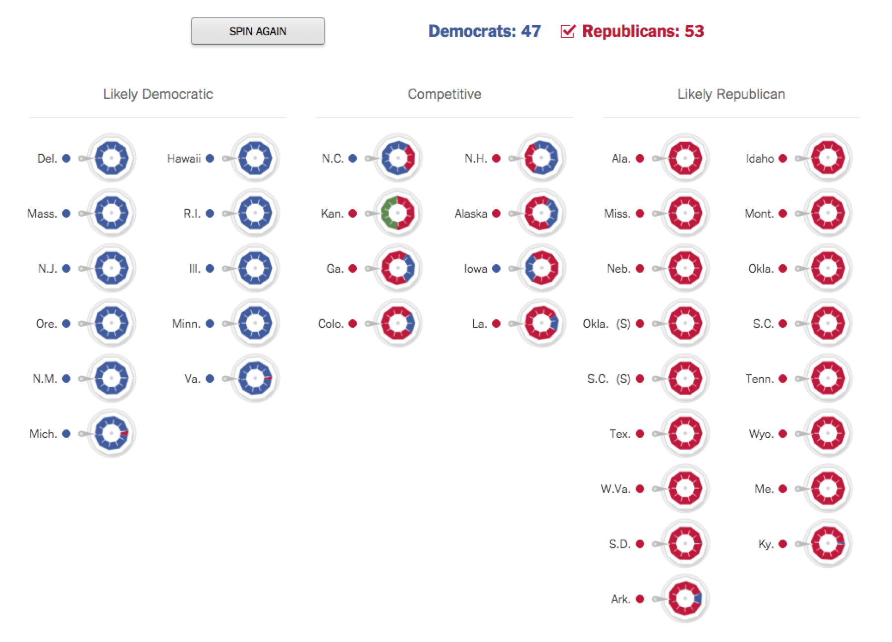
An illustration of the uncertainties in the outcome of the 2014 Senate races. Each time the user presses “spin again” the wheels rotate and stop at a random position. From The New York Times.71*
This visualization relies on the same logic we used to analyze the stoplight data in the last chapter—it uses many simulation runs to show how the effects of chance shape the data we see. Understanding how some underlying reality leads to the observed data helps you figure out what the reality is when you are trying to interpret the data.
These examples both involve numbers with some probabilistic error. Sometimes what we need to communicate is just a probability by itself.
Humans have a nonlinear perception of numerical probabilities, as they do with many other perceptions (such as brightness which is perceived on a logarithmic scale). Daniel Kahneman and Amos Tversky pioneered the measurement of probability perception in the late 1970s with an experiment that gave people a choice between two bets with given odds and payoffs. They showed that people deviate in predictable ways from the best strategy of valuing a bet according to its average winnings, which you get by multiplying the probability of winning by the payoff. In these experiments, people acted as if small odds were much higher and large odds were much lower.72 That is, people bet too much when the odds of winning were low, and too little when the odds of winning were high, even when they knew the exact odds!
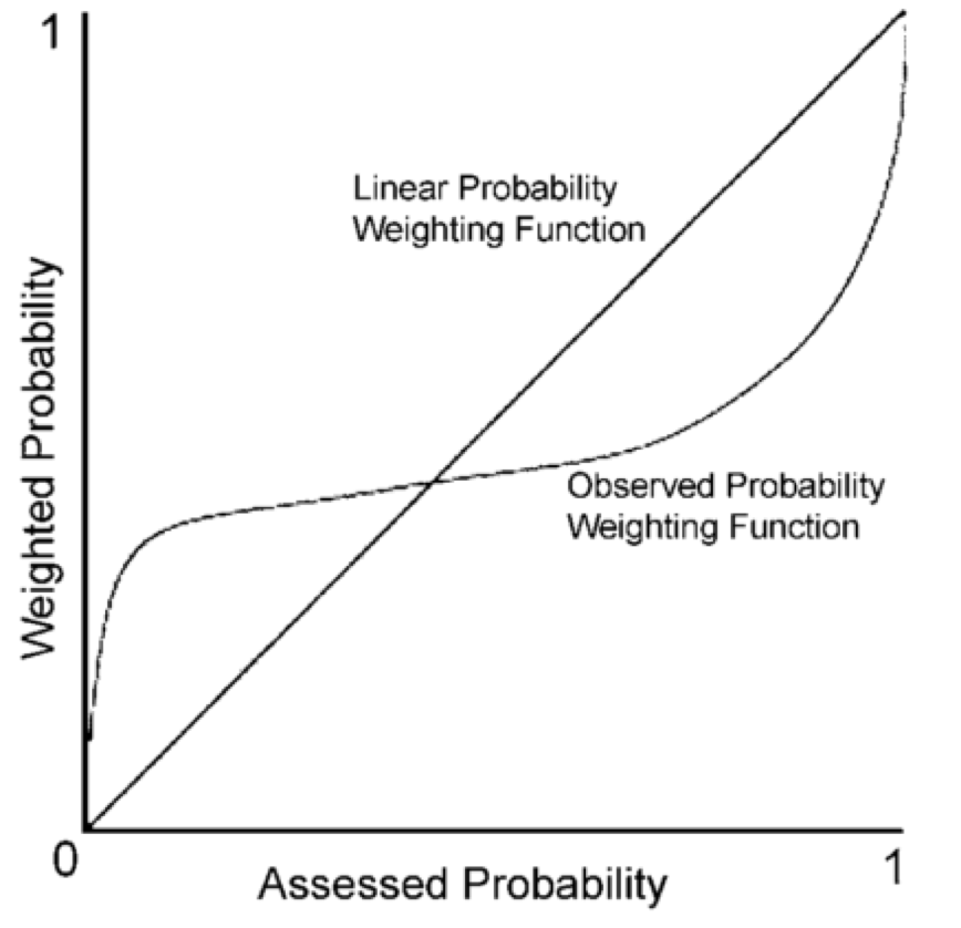
If this is how humans deal with probability figures generally, then we should expect people to exaggerate the probability of very rare events (like plane crashes) while underappreciating the probability of very likely events (like heart disease).
This is especially a problem when communicating small probability figures, such as rare risks. The probability of being struck by lightning in your lifetime is something around 0.0001.xxvii It's not immediately obvious what this means, but the chart above suggests that readers will tend to perceive getting struck by lightning as very much more likely than it actually is.
All sorts of things affect the perception of the probability of some event. If the event is very bad, we may perceive it as more common.73 We will also imagine it to be more common if it’s easy to bring examples to mind, a cognitive effect known as the availability heuristic. Thus, dying in a terrorist attack can seem just as probable as being struck by lightning even though a conservative estimate puts lighting at least ten times more likely. Telling people the actual numbers does not change this perception, because their perception is not based on numbers!
One way to communicate a probability is to talk about its frequency interpretation, that is, as a count of some number of things out of some larger number. When we say that the lifetime probability of getting hit by lightning is 0.0001, we mean that 1 in every 10,000 people will be struck. This is a much more intuitive way of thinking about probabilities for most people. It may be more likely to lead to correct reasoning when diagnosing a disease or making other sorts of inferences from uncertain evidence.74 Frequencies work particularly well if you can compare the denominator to familiar units of population. Let’s say there are 10,000 people is a small town; in a city of a million people, 100 will be struck by lightning. 10,000 is likely much more than the number of people you will know in in your lifetime, meaning that you probably won’t know anyone who has been or will be struck by lightning.
Comparisons are another useful way to communicate probability. The probability of getting hit by lightning is 0.0001, but the probability of dying in a car crash is 0.002, which is 20 times more likely. Again, thinking in terms of people helps: Out of 10,000 people, one will get hit by lightning, but 20 will die in a car crash. Get your measurements in units of people whenever possible—it’s a unit that everyone understands. This works particularly well as a visualization with little people icons:
Hit by lightning ☺
Dies in crash ☺☺☺☺☺☺☺☺☺☺☺☺☺☺☺☺☺☺☺☺
The ratio of the odds of something happening in one case as opposed to another is called odds ratio, and it’s a standard figure used to compare two groups. Here the odds ratio of car crash versus lightning is (20/9980) / (1/9999) ≈ 20. Often two groups are thought to have different risks or chances of something, like the probability of heart disease for those who do and do not exercise, or the probability of getting into college for those who went to different high schools.
An odds ratio clearly communicates the relation between two odds, but it obscures the overall magnitude of each. Sure, banning a toxic chemical can reduce the odds of a certain type of cancer by 2, but if only two people are expected to get that cancer then it’s not a very significant public health intervention. Whereas a tiny improvement in the odds of getting lung cancer might save thousands of lives.
It is possible to communicate both absolute and relative odds at the same time. Here’s smoking versus mortality again, this time by age:
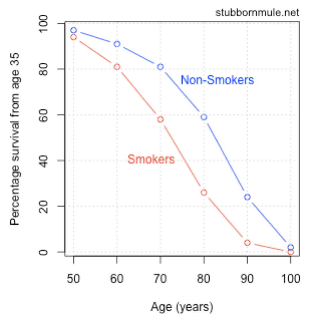
Smokers versus non-smokers survival curves, from stubbornmule.net.75
Everything you need to know is there, but it’s a little hard to interpret. Let’s see …60 percent of non-smokers will live to 80 versus 25 percent of smokers. Figuring out what this data means requires far too much messing around with the chart and thinking through figures. Compare to the visualization:
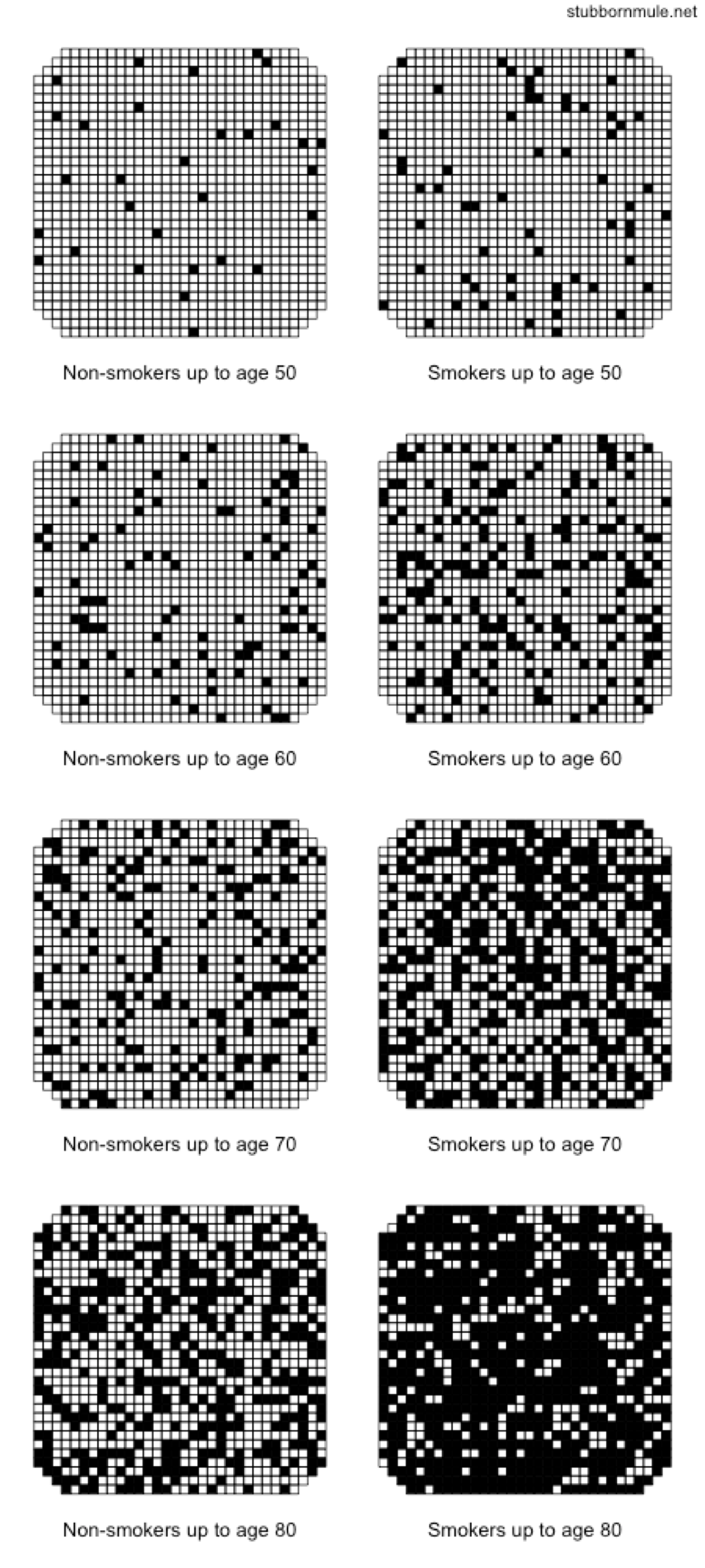
Smokers versus non-smokers survival curves, from stubbornmule.net.76
This visualization uses all the principles we’ve discussed. It represents probabilities as people, and compares probabilities both between smokers and non-smokers and between different ages. No one can know whether they will die from smoking, but visualizations like this can make the uncertainties personal.
There are lots of quantitative communication tricks and techniques you can pick up, and the visualizations here are not the last word in design. But the most important principle of communicating uncertainty is this: Communicate it. Don’t let someone come away from your story with a warped sense of the risk, or too certain about something subtle. This is just basic respect for the reader and for the difficulties of knowing.