Perception
Quick, which of these shapes is different?
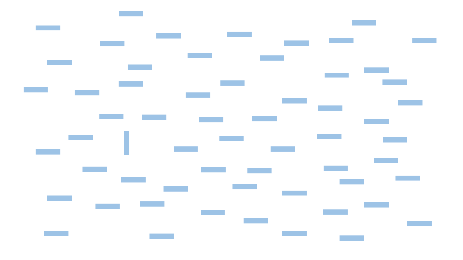
Well that was easy. How about now?
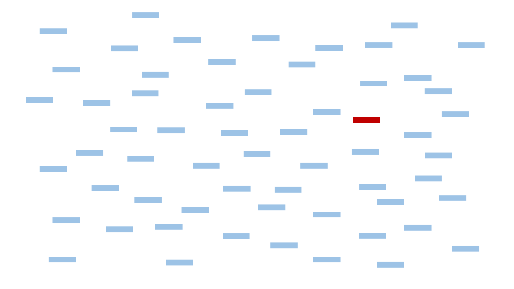
Now try this one. Which shape is different from all others here?
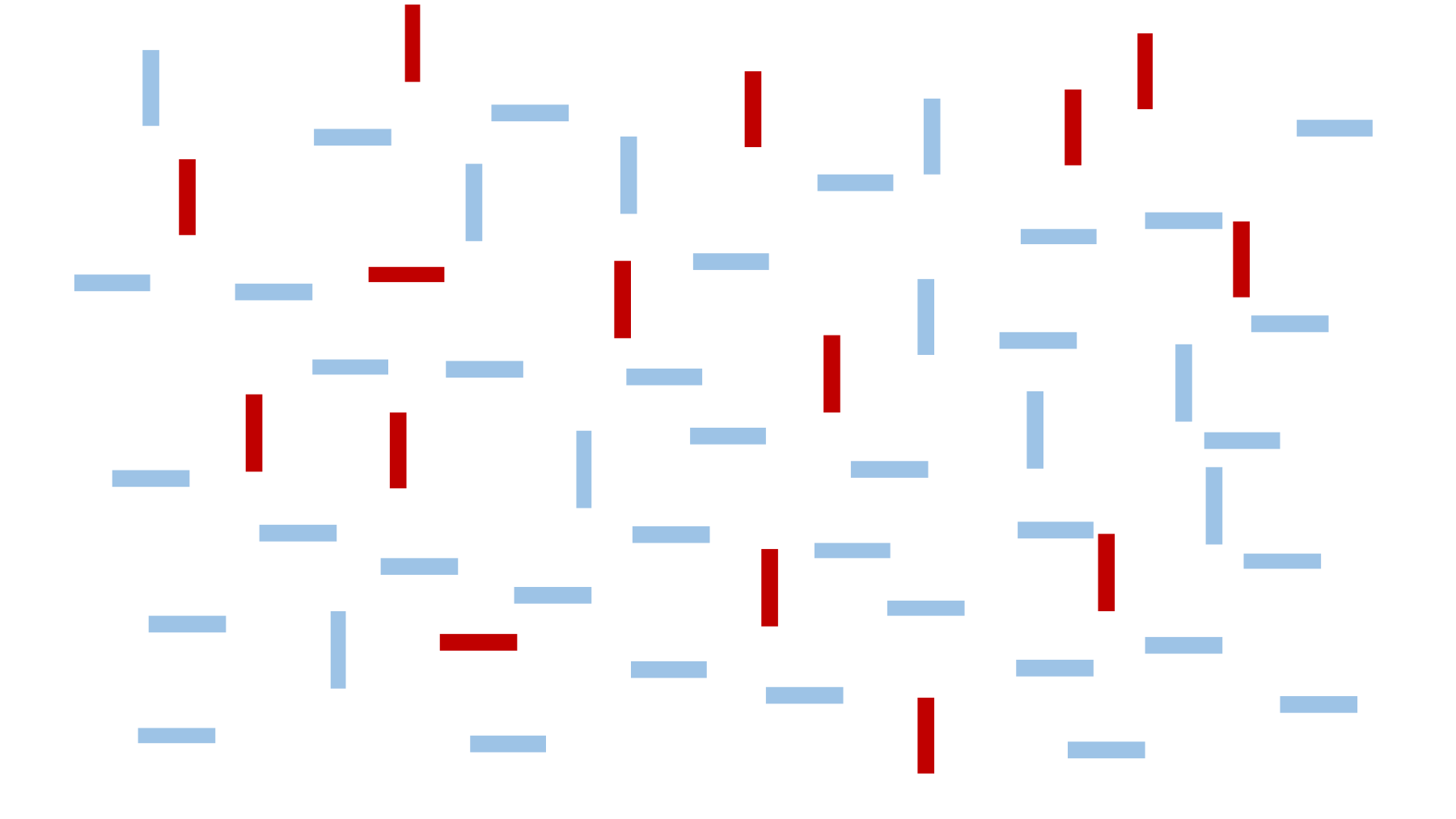
The first two were easy, but that one was slightly harder, right? These examples illustrate a visual ability called the pop-out effect, which lets you find something in a sea of similar objects without having to think about it. The object that is different just “pops out” at you. Except that sometimes it works better than others. You probably took a few seconds longer to find the single vertical light bar in the last image.
Pop-out sometimes works and sometimes doesn’t because you have “hardware” in your visual system that can perform complex processing tasks below the level of your consciousness. Under the right circumstances, color, orientation, shape, texture, motion, depth, flicker, and many other visual attributes can cause pop-out. But if the problem gets too complex for your highly specialized visual hardware, you have no choice but to do a “visual search” by scanning each object, like a Where’s Waldo book.
Your visual system can do all sorts of other neat tricks, like comparisons.
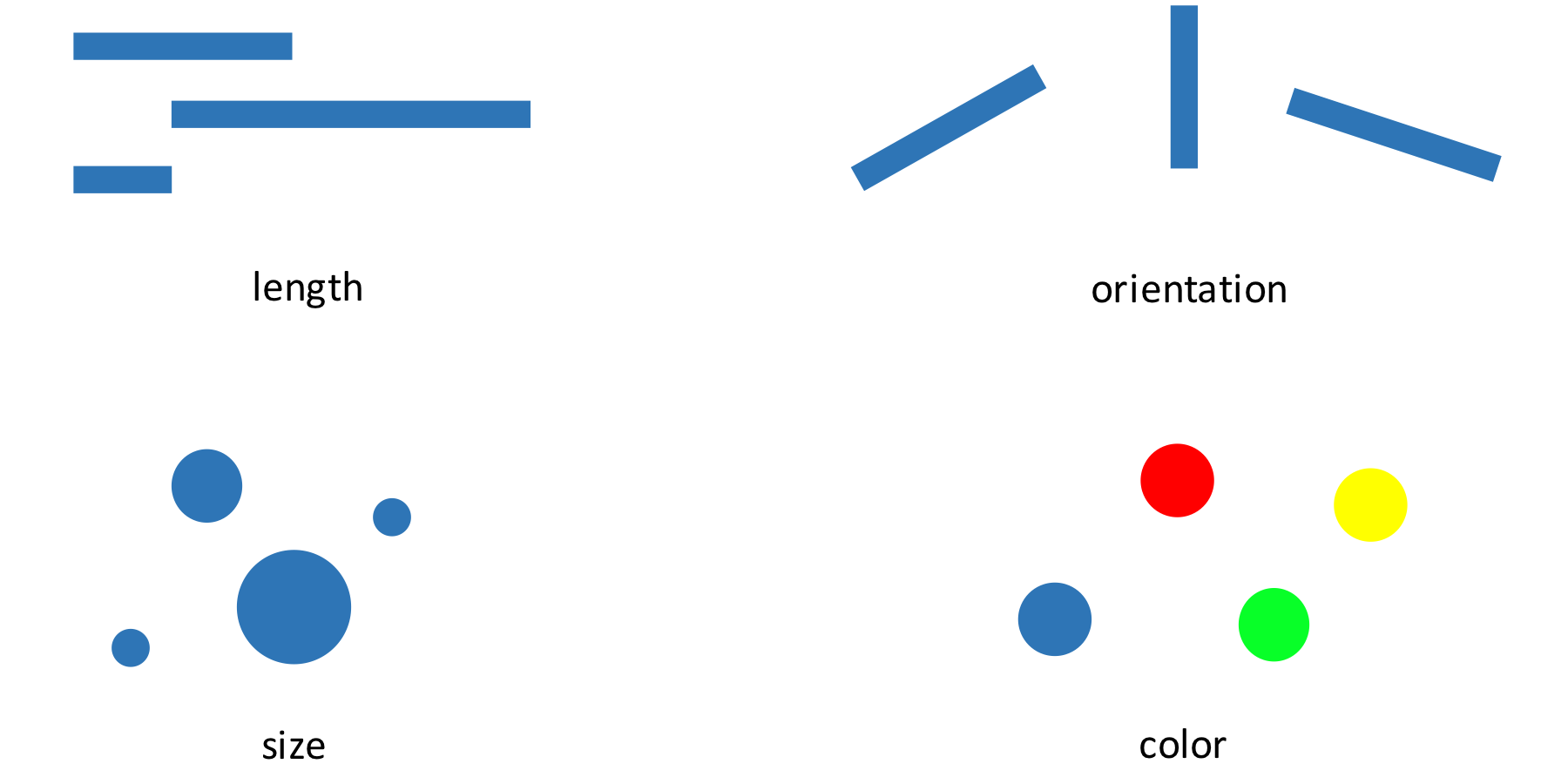
You don’t have to think to know which object is largest, or tilted down the most, or whether the circles are different colors. This is the basis of all data visualization: We are relying on very rapid, unconscious abilities of the human visual system to communicate data quickly. With a well-designed visualization, you don’t need to think about it to see a trend or a cluster.
Data visualization researchers have identified many important features of the human eyes and brain.57 There are different visual “channels” we might use to encode data, such as position, size, color, orientation, shape, texture, motion, depth, and a dozen more, and from experiments we know the effectiveness of these channels for different types of representation. For example, we know that position is the fastest and most accurate visual channel for comparing quantities, while color works great for categorical data but poorly for continuous variables. We’ve measured how perceived contrast changes depending on context, and explored how noise and clutter can slow down visual tasks. And we’ve teased out how pictures save on short-term memory. With a picture in front of you, you don’t need to store the relationships between elements in your working memory, because you can just look and see. This frees up your thinking for more sophisticated thoughts about the content.
Our visual processing system is so fast and sophisticated that maybe we shouldn’t think about it as cognition at all. Instead, it’s perception. It feels like you “just see” the important features of the visualization. But of course we don’t “just see.” Experimenters have mapped out exactly what we do and don’t see, and you can train your eye over time, too—like when you learned to recognize letters and then words.
Considering our visual abilities leads to important design choices. Our unconscious ability to compare lengths is why you should generally start the Y axis at zero. Otherwise, the relative lengths won’t correspond to the relative values, and we’ll perceive incorrect relationships. Ignoring visual perception when creating data visualizations is like ignoring the consensus meanings of words when writing.
But it’s not just vision we need to understand. We can’t possibly study the communication of data without studying the human perception of quantities. How our story is perceived depends on everything from vision to cognition to what the audience already believes.