Causal Models
Cause cannot usually be read directly from the data, no matter how much we might wish this were the case. Consider this graph of mortality versus smoking rate across different occupations:
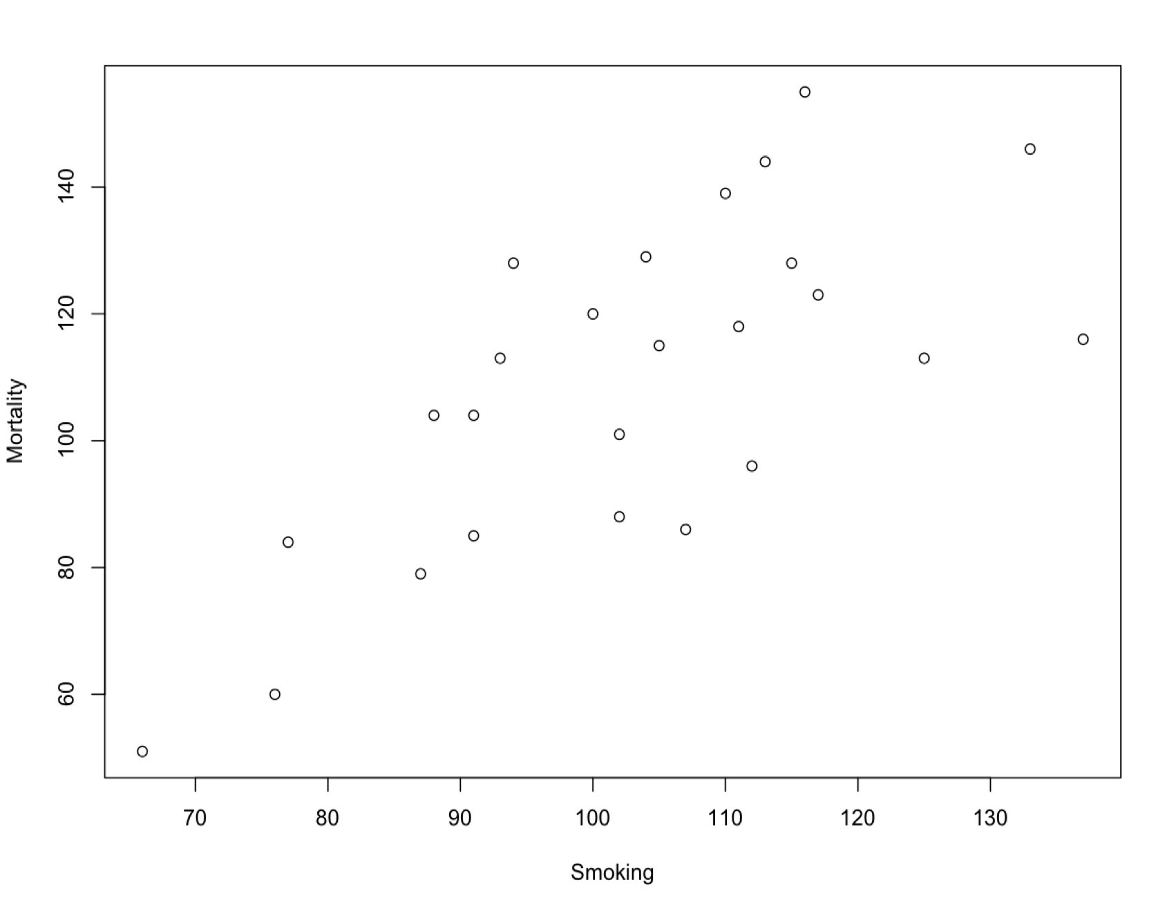
Normalized mortality rate versus smoking rate for different professions in the United Kingdom, 1970–1972.41
There is a clear association between smoking and mortality—a correlation. It seems natural to say that this is evidence that smoking contributes to an early death. But how about this chart:
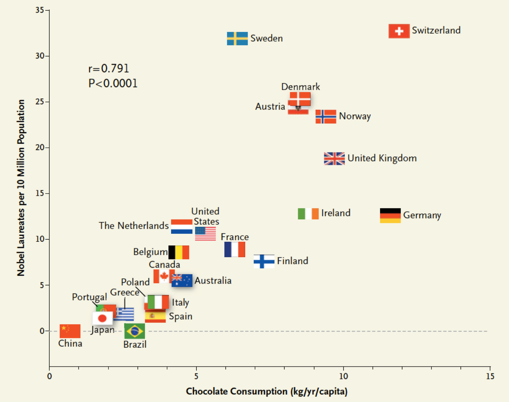
Correlation between countries’ annual per capita chocolate consumption and the number of Nobel Prize winners. From Messerli.42
If the previous chart shows that smoking causes premature death, then this chart shows that eating chocolate makes you more likely to win a Nobel Prize. No? But then why do we believe the first correlation is causal, while this one isn’t? There must be some other factor here; our reasoning must be including something other than just the data.
Here’s a more ambiguous case:
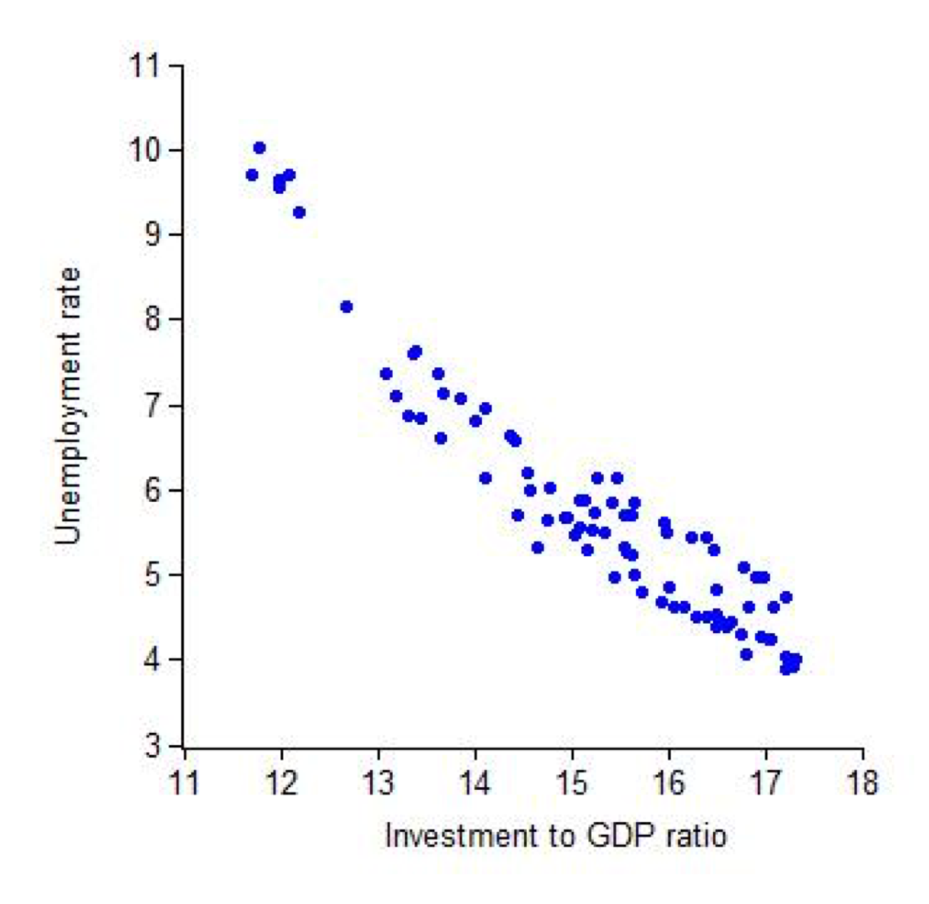
U.S. quarterly unemployment rate versus investment to GDP ratio from 1990 to 2010, plotted by John Taylor.43xx
How would you describe this graph? Maybe: When investment goes up, unemployment goes down. But saying it that way makes it sound like increasing investment would cause unemployment to drop, and that’s not necessarily true. We might as well say that when unemployment goes down, investment goes up, implying a cause in the other direction. Perhaps we could say: Investment and unemployment move together, in opposite directions. That’s all we actually know from this data, yet it feels unnatural to write about an association between two variables while saying nothing about the causal relationship between them. We are wired to see causes.
The difference in our intuitions about these three charts has to do with whether or not we know a story that explains how the cause relates to the effect. You can probably imagine how investment would lead to employment, or perhaps how employment would lead to investment. You’ve also probably heard that smoking causes cancer. But there’s no obvious story that links eating chocolate and winning a Nobel Prize.
We are dealing with a correlation here, a pattern in two variables such that when one changes the other changes as well. There are various mathematical definitions of a correlation, but for our purposes the most straightforward conception is fine. Scatterplots are a popular way to compare two variables, but anything which shows two variables can reveal a correlation. One of those variables might implicitly be the time of an event, as in our crime examples where we were looking at the correlation between a change in policy and the number of assaults or murders. Here’s another type of correlation, from an analysis of men writing a first message to women on the dating site OKCupid:44
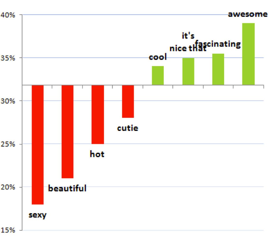
This data seems to show that including the word “awesome” in a first message will cause an above average reply rate, while including the word “sexy” will cause a much lower chance of a response. But that’s not what the data actually says. That’s just a story that leaps to mind. it’s easy to imagine why women would ignore a creepy first message from a stranger who called them “sexy.”
As usual, our stories about the data may or may not reflect reality, and the principle method of testing our stories is trying to imagine how else the data might have come to be. Fortunately, there are not that many ways two variables can become correlated.
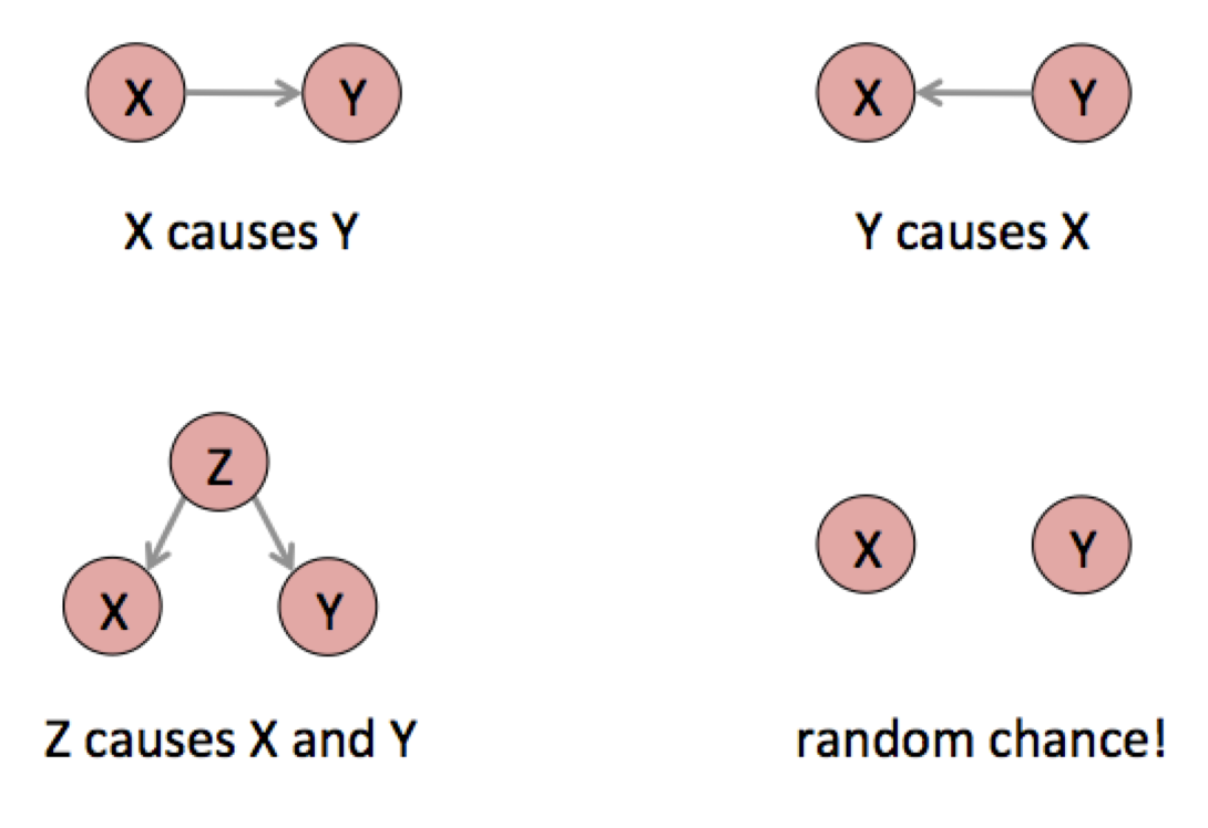
These little graphs are causal models. Like all statistical models, they are not reality but a way of talking and thinking about reality. Each circle is a variable, something that is or could be quantified. Each little arrow means “causes.” What exactly a “cause” is has been debated since Aristotle, but in this framework it is defined in terms of possible interventions: X causes Y means that there is some specific thing you could do in the world to force the variable X to take a specific value, and if you did that the outcome of Y would change in a probabilistic sense.
These causes are not definite. To say that smoking causes cancer means that if you could force someone to smoke, they would be more likely to get cancer. Not that they will get cancer, but that it increases the probability. The arrows in these diagrams are fuzzy, probabilistic cause. Instead of “causes,” think “changes the distribution of.”
This level of abstraction lets us talk about cause in a very general way. Every correlation of any two variables is the result of one of these causal patterns, or more likely a combination of them. Usually, the data alone cannot tell you which pattern produced your correlation.xxi For example, X causes Y and Y causes X appear the same in the data. We have to use other information to figure out the correct causal structure.
There could be no causal relationship at all, just random coincidence between X and Y. As we’ve seen, coincidence can be quantified by estimating the probability that chance generated your data. In the OKCupid case we could ask: How often does a randomly chosen word have an above- or below-average response rate as large as these words? If we plot the response rates of lots of words, we may find that these particular words are not special at all; this chart could just show some particularly entertaining words that have quite ordinary fluctuations in response rate. If you can cherry-pick the evidence, you can prove whatever you want.
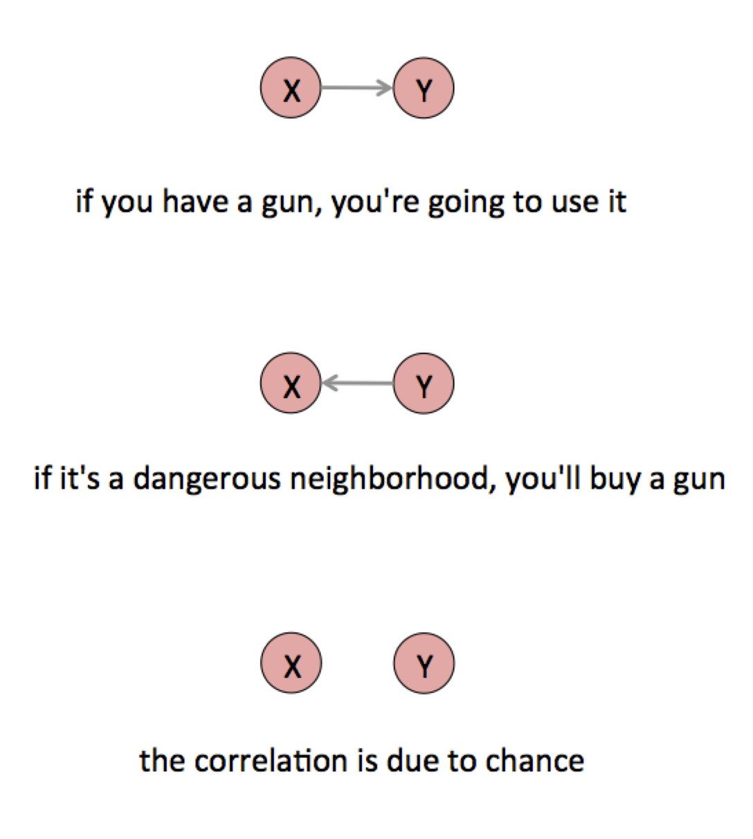
It can also be that Y causes X, but not in this case. The reply cannot cause the initial message because causes have to come before their effects. In other cases the causality could flow in the other direction, or the variables could affect each other in a feedback loop. High unemployment might be both a cause and effect of low investment. If cities with more guns are associated with higher crime, it could be that access to weapons causes crime, or it could be that living in a dangerous place makes people want to buy a gun. Or the association could have happened purely by chance.
In reality, it’s probably some combination of all of these effects. The data you have is the result of people using the guns they have and people buying guns because of the high crime rate and a whole range of chance factors.
It could also be the case that some other factor Z causes both X and Y. For example, there could be something that causes a man to write about a woman’s appearance and causes a woman to reply less often. This is the possibility most often neglected in casual data analyses, but there could be any number of factors that would influence both language use and response rate.
Like attractiveness. Perhaps attractive women get a lot more messages than average—too many to want to reply to all of them—so their overall response rate is lower. If we believe that “attractiveness” is a real and coherent notion that could be usefully measured in some way—perhaps by asking many people to rate a photograph—then it is reasonable to talk about it as a variable. This leaves us with two plausible hypotheses.
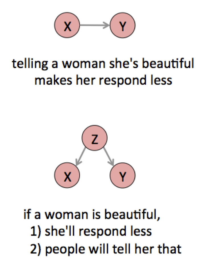
There is no way to tell these two hypotheses apart from the data above, because both would produce the same correlations.
The third variable in this three-way structure is called a confounder, and confounding variables appear frequently in real world analyses. The key is to look for another variable that causes both of the variables you see as related. For example, overall economic growth could both reduce unemployment and increase investment. A rich country might both import a lot of chocolate—a luxury good—and fund advanced research. The reduction in crime rates after the bar’s closing time changed could be because the police began patrolling to enforce the earlier closing time.
But then again, a stressful profession could both make you smoke and reduce your lifespan. The tobacco industry has attacked the association between smoking and disease for decades on precisely this basis of possible confounding variables (and many other arguments45). In the mid 1960s, one statistician received tobacco industry funding “to seek to reduce the correlation of smoking and diseases by introduction of additional variables.”46 As repugnant as this might be, we have to take seriously the logical possibility of a spurious correlation. Ultimately, the proof of smoking’s harm also relies on other types of non-correlational evidence such as animal experiments. We can tell a story about smoke causing cancer that we can confirm in the lab.
Confounding variables are common in practice. Coffee might cause cancer, but then again maybe a certain type of person both smokes and drinks coffee.47 Poor sleep might cause poor grades in school, or poverty might cause both.48 The confounding circumstance may not be measured in the data you have and may not even be something that can be measured directly. You can only find a confounder by thinking about the broader context of the data.
Once you have found a confounding variable, it may be possible to subtract off its effect, a process that is called controlling for a variable. For example, you could investigate the relationship between smoking and cancer while controlling for the stress of different professions. This only works if your causal model is otherwise accurate. Again, it’s a way to ask about a counterfactual: What would be the relationship between employment and investment if growth didn’t drive both of them? Or how much would women make if they worked the same number of hours as men? Reasoning about imaginary worlds is always tricky.
I’ve used pictures informally to talk about causal structures, but they’re actually part of a well-founded mathematical theory of cause developed in late twentieth century by Judea Pearl and others.49 These pictures are called graphical models, not because they are graphics but because they are graphs in the mathematical sense of nodes and edges. You can use them to describe much more complex causal structures with more variables, like this model from one of my favorite statistics books:
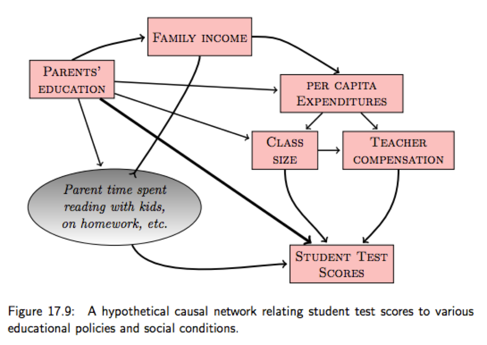
From Kaplan.50
In this invented network we have data for the pink variables but not the gray variable. In general there will be many intervening factors you can’t measure, as well as unknown causes that you may never have thought of. You just don’t know the correct causal structure of the world, but at least you can draw little pictures of the possibilities you can imagine.
The best way to figure out causation is to do an experiment. After all, causation is defined in terms of interventions, and an experiment is all about intervening. In the online dating case, we could take many men and randomly tell each one to include or exclude certain words in their first message to a woman, then tally the response rate for each word. This is different from the data we already have in a crucial way. In this experiment the men do not decide which words to use (we have intervened!). They cannot base their decision on the woman’s appearance, or for that matter anything about themselves or the woman to whom they are writing. This removes the effect of many potential confounding variables in one shot.
This type of experiment is a generalization of the idea of comparing cases. We repeat a particular scenario many times with and without the hypothetical cause and see if the effect appears more often when the cause is present. John Stuart Mill wrote about this “method of difference” in his 1843 A System of Logic:
If an instance in which the phenomenon under investigation occurs, and an instance in which it does not occur, have every circumstance save one in common, that one occurring only in the former; the circumstance in which alone the two instances differ, is the effect, or cause, or a necessary part of the cause, of the phenomenon.51
Mill understood that it would not always be possible to distinguish “X causes Y” from “Y causes X” from data alone (“is the effect, or cause”). Experiments are one way out, because we set the value of X and watch what happens to Y. The hitch is that we don’t know what would have happened to Y if we didn’t set X. How many non-smokers would have developed lung cancer anyway? This is why modern experiments use a control group for comparison. To ensure that the two groups are otherwise identical (“every circumstance save one in common”), we can randomly assign people between them. This basic design was formalized at the end of the nineteenth century and is known as a randomized controlled experiment.
But again, journalists don’t normally get to do experiments. Sometimes we can evaluate other people’s experiments, but usually we are reduced to dealing with observational data. This makes cause an especially tricky subject. Causal models—our little arrow diagrams—are a way of expressing the possible causal relationships between variables. This can clarify our thinking and hopefully lead to ideas about how to test our stories against reality.