Examples Trump Statistics
Taking responsibility for the impression that the reader comes away with requires an understanding of how people integrate different types of information. And generally, examples are much more persuasive than statistics—even when they shouldn’t be.
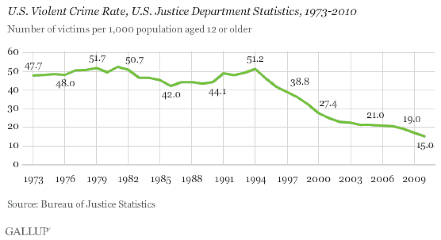
The United States has seen a two-decade-long decline in violent crime rates. This holds across every type of violent crime and in every place.

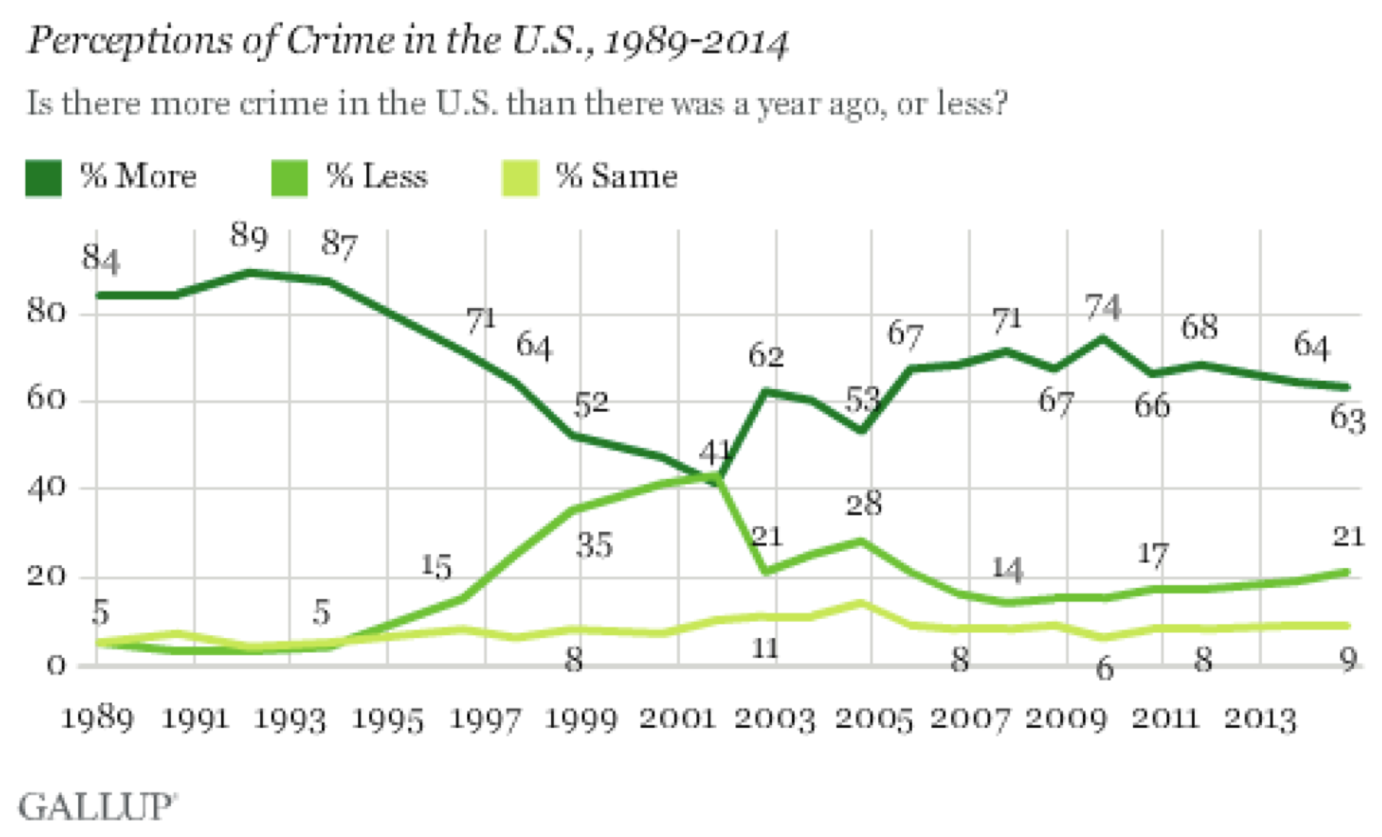
Over the same period of time, there has a been a very widespread perception that crime is getting worse.58

The number of people who believe that crime is worse this year than last has hovered around 60–80 percent for decades, even as the number of people who have been the victim of a violent crime has fallen by a factor of three. Gallup goes so far as to say “perceptions of crime are still detached from reality …federal crime statistics have not been highly relevant to the public’s crime perceptions in recent years.”59
How can this be? There is a wealth of data on crime in the United States, most of it freely available, and crime rate figures have been repeated endlessly in news stories. Surely this is an easily correctable misperception. (And it’s definitely a misperception. Although there are all sorts of issues in counting crime, violent crime rates are thought to be the most accurate type of crime data because the seriousness of incidents like homicide makes them harder to hide and easier to count.)
I don’t know for certain why perception is so far from reality in this case—I don’t think anyone really does—but the pattern fits what we’ve seen in experiments.
It was not until the 1970s that researchers investigated the human perception of statistical information in a serious way. Near the end of that decade, Hamill, Wilson, and Nisbett asked a simple question: How does statistical information change the perception of an anecdote?60
These researchers wanted to see if people would discount an extreme example when they were given statistics that showed it to be extreme. So they showed over a hundred people a New Yorker article about a welfare recipient:
The article provided a detailed description of the history and current life situation of a 43-year-old, obese, friendly, irresponsible, > ne’er-do-well woman who had lived in New York City for 16 years, the last 13 of which had been spent on welfare. The woman had emigrated from Puerto Rico after a brief, unhappy teenage marriage that produced three children. Her life in New York was an endless succession of common-law husbands, children at roughly 18-month intervals, and dependence on welfare. She and her family lived from day to day, > eating high-priced cuts of meat and playing the numbers on the days immediately after the welfare check arrived, and eating beans and borrowing money on the days preceding its arrival. Her dwelling was a decaying, malodorous apartment overrun with cockroaches …61
This was a real person, but she was not a typical case, because almost no one stays on welfare for 13 years. One group of readers also saw statistical information showing this was so:
Statistics from the New York State Department of Welfare show that the average length of time on welfare for recipients between the ages of 40 and 55 is 2 years. Furthermore, 90 percent of these people are off the welfare rolls by the end of 4 years.62
The other group of readers was given false statistical information that made 13 years seem like a normal length of time:
Statistics from the New York State Department of Welfare show that the average length of time on welfare for recipients between the ages of 40 and 55 is 15 years. Furthermore, 90 percent of these people are off the welfare rolls by the end of 8 years.63
Then everyone was given a brief quiz with questions about their perception of welfare recipients such as:
How hard do people on welfare work to improve their situations? (1 = > not at all hard, 5 = extremely hard)64
As you might expect, most people came away from all of this with a rather negative impression of people on welfare—much more negative than a control group who did not read the story. But there was no meaningful difference in the opinions of those who read the real versus fake statistics, and no difference when the statistics were presented before versus after the story.
The description of the woman in her shabby apartment is so vivid, so real, so easy to connect to our own experiences and cultural stereotypes. It completely overwhelms the data. it’s not that people didn’t remember the average length of time someone stays on welfare; they were quizzed on that, too. The statistical information simply didn’t figure into the way they formed their impressions.
I certainly don’t blame readers for this; it’s never worthwhile to blame your readers. Nor am I convinced I would be any different. I don’t think it’s clear enough that this woman was atypical, vivid examples are persuasive, and readers had no reason to be especially careful. Rather than shaking my faith in the intelligence of humanity, I just see this as a lesson in how to communicate better.
There have been other experiments in a similar vein, and they usually show that examples trump statistics when it comes to communication. In one study people were asked to imagine they were living with chest pain from angina and had to choose between two possible cures. They were told that the cure rate for balloon angioplasty was 50 percent and the cure rate for bypass surgery was 75 percent. They also read stories about people who underwent different surgeries. In some cases the surgery succeeded in curing their angina and in some it failed, but these examples contained no information that would be of use in choosing between the surgeries. Even so, people chose bypass surgery twice as often when the anecdotes favored it, completely ignoring the stated odds of a cure.65
Which brings us back to crime reporting. In major cities, not every murder makes the news. In different times and places the number of reported murders has varied between 30 percent and 70 percent of the total.66 The crimes that get reported are always the most serious. Content analysis has shown that coverage is biased toward victims who are young, female, white, and famous, as well as crimes which are particularly gruesome or sexual. Yet these examples are the stuff from which our perceptions are formed. it’s enough to make a media researcher weep:
Collectively, the findings indicate that news reporting follows the law of opposites—the characteristics of crimes, criminals, and victims represented in the media are in most respects the polar opposite of the pattern suggested by official crime statistics.67
Not only is crime reporting biased in a statistical sense, but the psychological dominance of examples means that readers end up believing almost the opposite of the truth. This is a type of media bias that is seldom discussed or criticized.
If you want the reader to walk away with a fair and representative idea of what the data means out in the world, then your examples should be average. They should be typical. This goes up against journalism’s fascination with outliers. It’s said that “man bites dog” is news, but “dog bites man” is not. But if we want to communicate what the bite data says we should consider going with “dog bites man” for our illustrative examples.
My favorite stories draw on both statistics and examples, using complementary types of information to build up a full and convincing picture. But generally, examples are more persuasive than statistics presented as numbers. Individual cases are much more relatable, detailed, and vivid, and they will shape perception. The bad news is that poorly chosen examples can create or reinforce bad stereotypes. But this also means that well-chosen examples bring clarity, accuracy, and life to a story, as every storyteller knows.