Who Is in the Data?
Data about people affects people’s lives. Urban planners, entrepreneurs, social critics, police—all kinds of people use data-based representations of society in their work. This is why the issue of representation is so important. Changing how someone is perceived, or if they are perceived at all, can have enormous effects.
The “goodness” of a representation depends on what you want to do with it—the story you are telling—but in many cases it seems most fair to count each person equally. There is a nice alignment here between democracy and statistics, because the simplest way to generate data is to count each item in exactly the same way. Random samples are also very popular, but they are just a practical method to approximate this ideal. This moral-mathematical argument on the representativeness of data is almost never spelled out, but it’s so deep in the way we think about data that we usually just say data is “representative” of some group of people when it approximates a simple count.
The data you have may deviate from this ideal in important ways.
Journalists have been trying to portray the public to itself for a long time. When you read an article about student debt that quotes a few students, these students are standing in for all students. Broadcast journalism’s “person on the street” interview brings the reader into the story by presenting the opinions of people who are “just like them.” Of course, it never really works out that way; reporters only interview a small number of not-really-random people, and television crews tend to film whomever is easiest to get on camera.
When Osama bin Laden was killed in 2011, the Associated Press undertook a project to gather reactions from all over the world. Reporters rushed to pick up any camera they had and ask the same scripted question of many people. But which people? In practice it will depend on factors like which reporters are most keen on the project, who the reporters already know, who is easiest to get to, and who is most likely to speak a language the reporter understands. The project was meant to capture the global response to a historic event, but it’s not clear whose voices are actually represented. A global, random video sample on a breaking news deadline would be quite a challenge, but perhaps you could try to get a certain range of country, age, race, gender, and so on.
Social media seems to offer a way out, because it represents so many more people. No doubt bulk social media analysis can be a huge improvement over a handful of awkwardly chosen sources. But social media isn’t really representative either, not in the sense that a random sample is.
Here’s New York City, as revealed by geocoded tweets:68
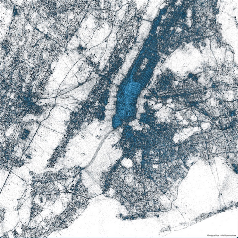
I find this map beautiful and revealing. it’s not a map of geography or political boundaries, but a map of people. I love how it traces major transit routes, for example. But it is only a map of certain types of people, as I know from comparing it to a population-density map. There are large sparse areas in Brooklyn where plenty of people live, and Soho is definitely not as dense as Midtown. Also, only a few percent of tweets are geocoded. What sort of person uses this feature?
Not everyone is on Twitter, not everyone is Tweeting, and even fewer are speaking on the topic of your story. This data has a bias toward certain types of people, and you don’t really know which kind of people those are. There is surely useful information to be got from social media, but it is not the same kind of information you can get from a random sample.
Whether or not this is a problem depends on your story. Twitter users tend to be affluent and urban, so if that’s the population you want to hear from, you’re good. If it’s not, there may not be much to say from a Twitter analysis. Any representation of public sentiment created from social media data—a word cloud or anything else—will be biased in an unknown way. That is, the results will be skewed relative to a random sample, and the worst part is you won’t know how skewed they are.
The way you choose your data can also create representativeness issues. Here’s a visualization by Moritz Stefaner that is meant to show the “Vizosphere,” the people who make up the data visualization community.
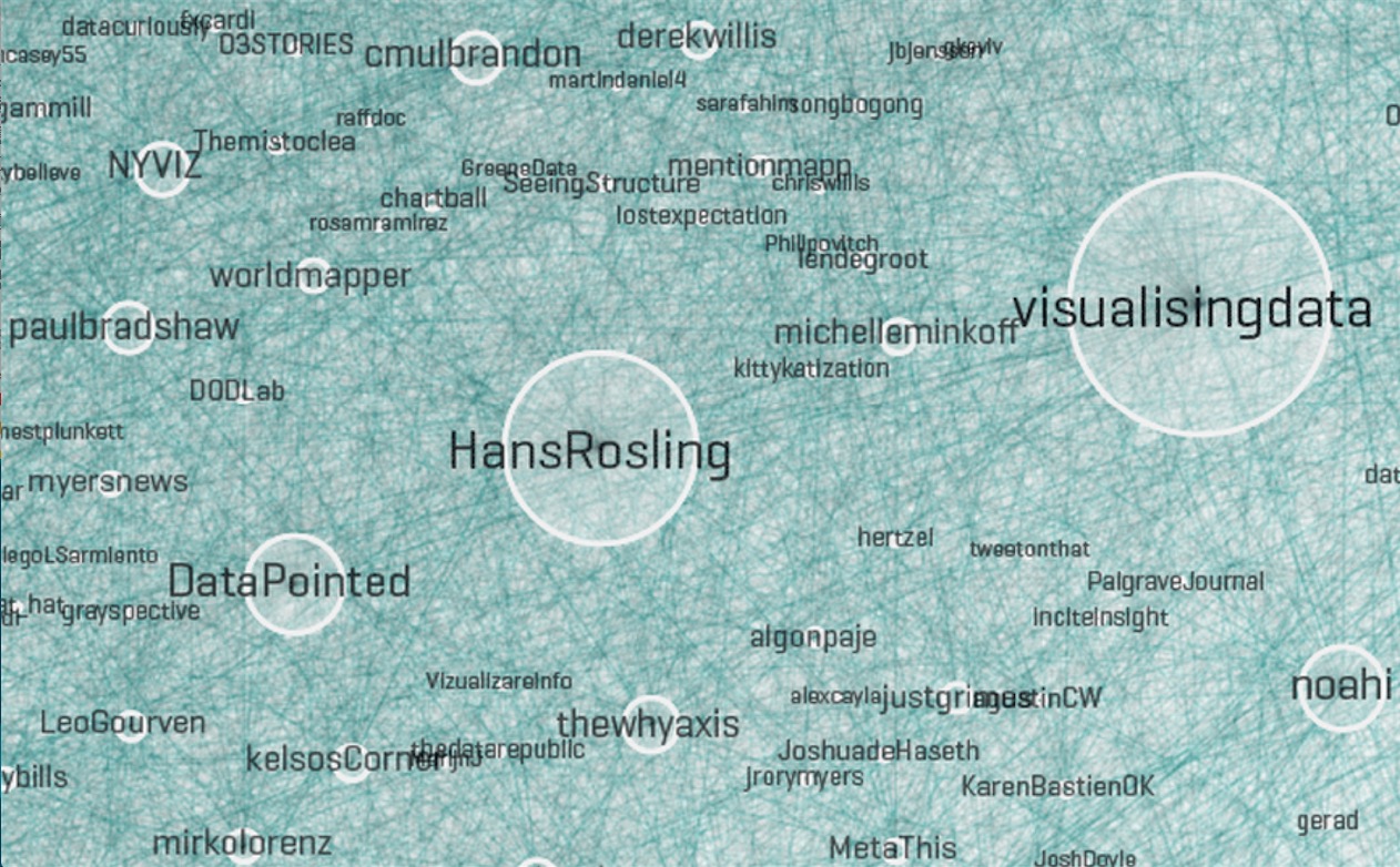
Excerpt from the Vizosphere by Stefaner.69
Of course it’s not really a visualization of everyone involved with visualization. To create this picture, Stefaner started with “a subjective selection of ‘seed accounts,’ ” meaning the Twitter handles of 18 people he knew to be involved in visualization. The 1,645 people included in the picture are all following or followed by at least five of these accounts.
The result is a very interesting representation of some people involved in visualization but certainly not everyone involved in visualization. Why these 18 accounts? Why not include people with four links instead of five? Part of the problem is that there is no universally accepted definition of who is “in” the visualization community, but even if there were, it’s doubtful Twitter network analysis would be the way to find them all. This chart almost completely excludes the scientific visualization community, hundreds of people who have been doing visualization for decades.
Stefaner knows there are issues of this sort, and says so in the description of this image. There’s nothing wrong with all this. But if it were to be presented as journalism, would readers need to parse the fine print to get an accurate understanding?