- NewsLynx
- Introduction
- 1. Executive Summary
-
2.
Introduction
- 2.1. Definitions
- 2.2. Previous Research
- 2.3. From Monitoring and Evaluation to Media Impact
- 2.4. The Rise of Nonprofit Journalism
- 2.5. The Quantification of Content
- 2.6. Current Efforts
- 2.7. Qualitative Projects
- 2.8. Quantitative Projects
- 2.9. Internal Newsroom Tools
- 2.10. Where NewsLynx Fits: Incorporating Qualitative and Quantitative
- 3. Research Findings
-
4.
Platform Description
- 4.1. The Model
- 4.2. The Impact Framework, as Implemented
- 4.3. Model Concept: Impact Tags
- 4.4. Model Concept: Categories
- 4.5. Model Concept: Levels
- 4.6. The Combination of Tags, Categories, and Levels
- 4.7. Other Concepts for Possible Inclusion
- 4.8. Model Concept: Subject Tags
- 4.9. NewsLynx Interface
- 4.10. This Story’s Life
- 4.11. How People Are Reading and Finding It
- 4.12. Who Tweeted It?
- 5. Newsroom Use
-
6.
Recommendations and Open Questions
- 6.1. Impact Work Practices: Recommendations
- 6.2. Commit Resources
- 6.3. Integrate with Editorial
- 6.4. Start Small
- 6.5. Publish Both for Humans and Machines By Using Standards
- 6.6. Impact Work Practices: Open Questions
- 6.7. Building Impact Tools: Recommendations
- 6.8. Building Impact Tools: Open Questions
- 7. Future Paths for NewsLynx
- 8. Conclusion
- 9. Appendix A
- 10. Appendix B
- 11. Footnotes
- 12. Citations
NewsLynx Interface
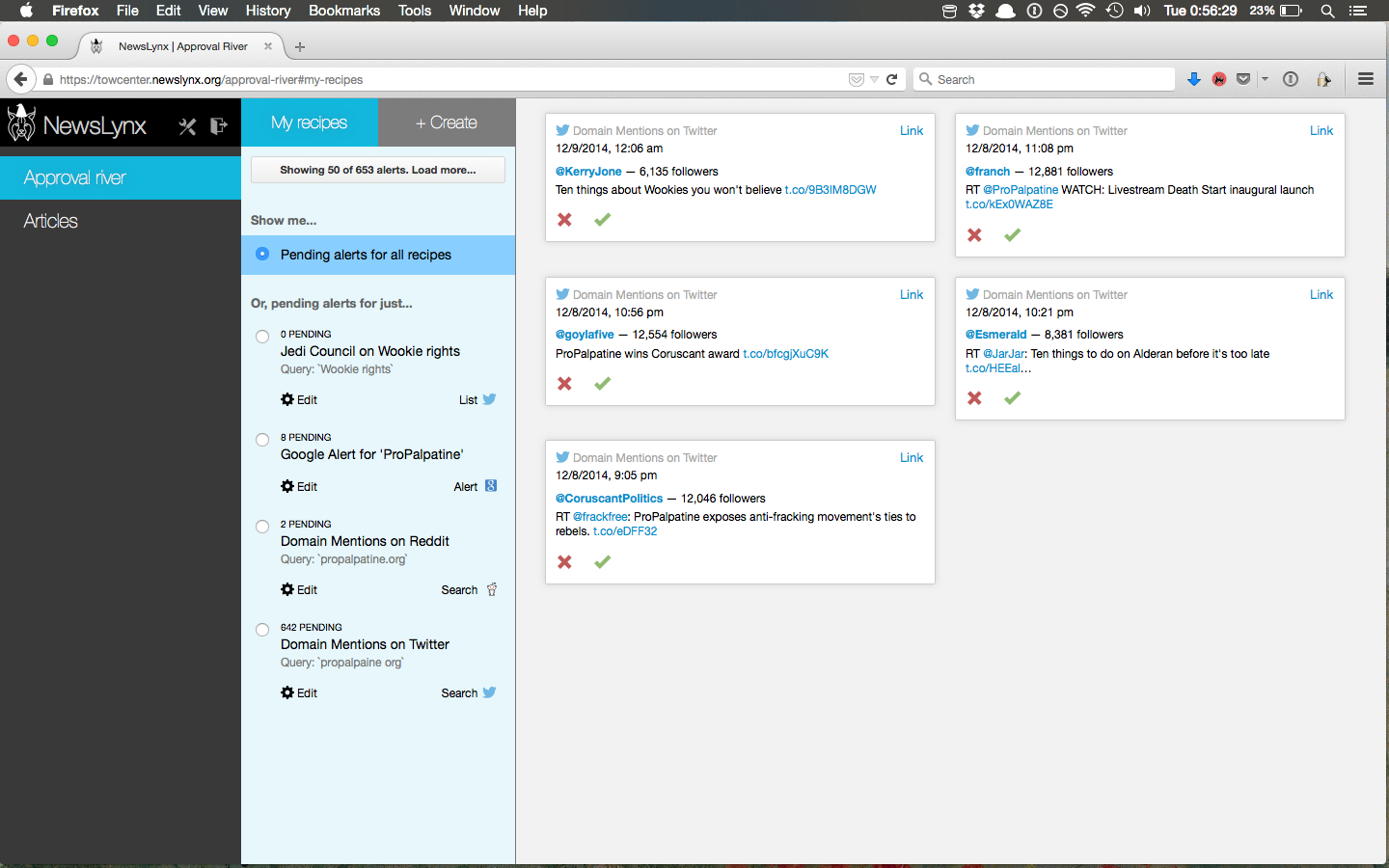
The Approval River
The NewsLynx Approval River is a section where users manage impact indicators for stories their newsroom publishes. It allows users to create “recipes” that let them connect to existing clip-search-type services or perform novel searches on social media platforms. The results of these recipe searches go into a queue where they can be approved or rejected.
 The tool is designed to streamline (and perhaps replace) an existing
common workflow for measuring impact where IEs monitor one or more
news-clipping services for mentions, local versions, or republication of
their work (if the organization allows that). Many of the IEs we
interviewed expressed difficulty in managing the diversity of clipping
services they used, as well as storing the meaningful hits in one place.
In addition, the process’s complicated nature—often requiring different
login credentials for each service—took up an inordinate amount of time
and raised the barrier to entry for training someone new on the system.
The tool is designed to streamline (and perhaps replace) an existing
common workflow for measuring impact where IEs monitor one or more
news-clipping services for mentions, local versions, or republication of
their work (if the organization allows that). Many of the IEs we
interviewed expressed difficulty in managing the diversity of clipping
services they used, as well as storing the meaningful hits in one place.
In addition, the process’s complicated nature—often requiring different
login credentials for each service—took up an inordinate amount of time
and raised the barrier to entry for training someone new on the system.
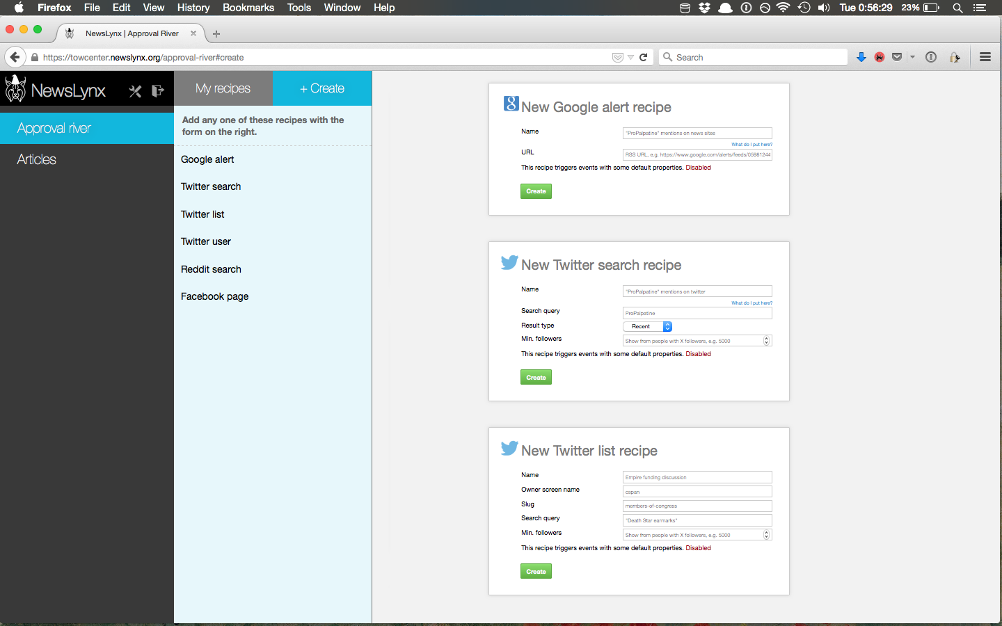
Out of the box, NewsLynx supports the following recipes:
Google Alert
Twitter List
Twitter User
Twitter Search
Facebook Page
Reddit Search
The Approval River provides easy methods for gathering information from social platforms. For example, one recipe service NewsLynx includes is the ability to search a Twitter List for keywords. Let’s say, as a part of an investigation, your organization has identified 25 key influencers or decision-makers and has added their handles to a Twitter List. A recipe could watch that list and notify you of discussion on the topic, or when anyone on it shares a URL from your site. This alert would show up in the Approval river and, if approved, would be assigned to the relevant article with any other information the IE wishes to add.
A simple way to think of this page is, “if this, then impact.”
With some programming knowledge, anyone can add new recipes or NewsLynx can be set up to receive emails from different clipping services and process those streams as recipe feeds as well.
Analytics Tools
The analytics section is where we hope users can gain insight into metrics that interest them and view any information about an article all in one place.
We designed this section of the platform with two guiding principles in mind: Make it navigable for the average newsroom user and give context to numbers and events wherever possible.
On the first point, we organized our data and presentation at the article level, which is often not the case in platforms such as Google Analytics. We also labeled our graphs and data visualizations with sentences and questions, such as “who’s sending readers here?” instead of more ascetic labels like “traffic-referrers.” On this point we were inspired greatly by NPR’s previously mentioned internal metrics dashboard, which proposes these semantic headers as a way to make dashboards more easily approachable for average newsroom users.55 To understand “how well a story did,” metrics need context. As a result, our other principle was never to show a number in isolation—any value should always be contextualized with respect to some baseline. In our two analytics views—the multi-article comparison view and the single-article detail view—we provide this by always comparing a given metric to a baseline value, such as “average of all articles along this metric.” Users can easily change this baseline to the average of all articles in a given subject-tag grouping. In other words, “show me how these articles performed as compared to all politics articles.”
We also do our own novel data collection to view article performance in the context of newsrooms’ promotional activities. For instance, we collect when a given article appeared on a site’s home page, when any main or staff Twitter accounts tweeted it out, and when it was published to the organization’s Facebook page or pages.
We’ll walk through each section to see how we implemented these comparisons and context views in the platform.
Article Comparison View
When users open the Articles screen, they see a list of their top 20 articles with bullet charts across common Google Analytic and social metrics.iv Bullet charts are so named because they include a small bar, the bullet, that can show whether a given metric is above or below a certain reference point. In this view, users can see which articles are over-performing or under-performing at a glance based on whether the blue bar extends beyond the bullet or falls short, respectively. Users can change the comparison point from “all articles” to any group of articles sharing a subject tag.
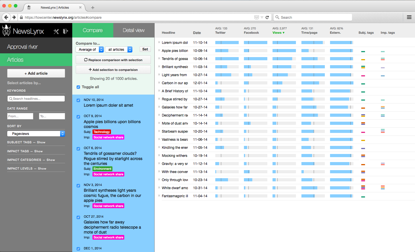 To guard against a few high-performing articles skewing the results, the
bullet charts use the 97.5 percentile as the maximum value. In addition,
users can select the median value as the comparison point as opposed to
the average, since the median will be more resilient to outliers skewing
results. Users change the comparison point using the dropdown menus at
the top of the middle column.
To guard against a few high-performing articles skewing the results, the
bullet charts use the 97.5 percentile as the maximum value. In addition,
users can select the median value as the comparison point as opposed to
the average, since the median will be more resilient to outliers skewing
results. Users change the comparison point using the dropdown menus at
the top of the middle column.
The design of this section is meant for small-batch comparisons between groups of articles. For instance, IEs can compare the seven articles in one investigation against those from another package, or they could compare recent articles against historic performance.
Article Detail View
NewsLynx also lets users easily drill-down to the individual article level to see a timeline of qualitative and quantitative performance, as well as contextualized detailed metrics about traffic sources and reader behavior.
This view also shows top-level tag information, allows users to manually create an impact event, as well as download an article’s data.
The information on this page is divided into three sections:
This story’s life—A time series of page views, Twitter mentions, Facebook shares, time on home page, internal promotion, and online or other offline events created manually or as assigned through the Approval River.
How people are reading and finding it—A selection of Google Analytics metrics around platform breakdown, internal versus external traffic, and top referrers. Similar to the comparison view, each metric includes a customizable comparison metric.
Who tweeted it?—A comprehensive-as-possible list of accounts that have tweeted the article sorted by the account’s number of followers.v
In the interface, these three sections described above are prefaced by the text, “Tell me about…” in an effort to make their use and functionality readily apparent to the user.