Interface Design and Signage
When done well, the design for a user interface or graphic identity seems simple, intuitive, and even obvious. Of course, the best and most effortless interfaces are the hardest to create, often requiring multiple experiments and iterations.
Such was certainly the case for the You Are Here web interface, whose final version consists of a simple title banner and an image overlaid with a large “play” button. Below this, a short written prompt and a bright “Tap to Call” graphic clearly invites listeners to join the conversation.
0.45 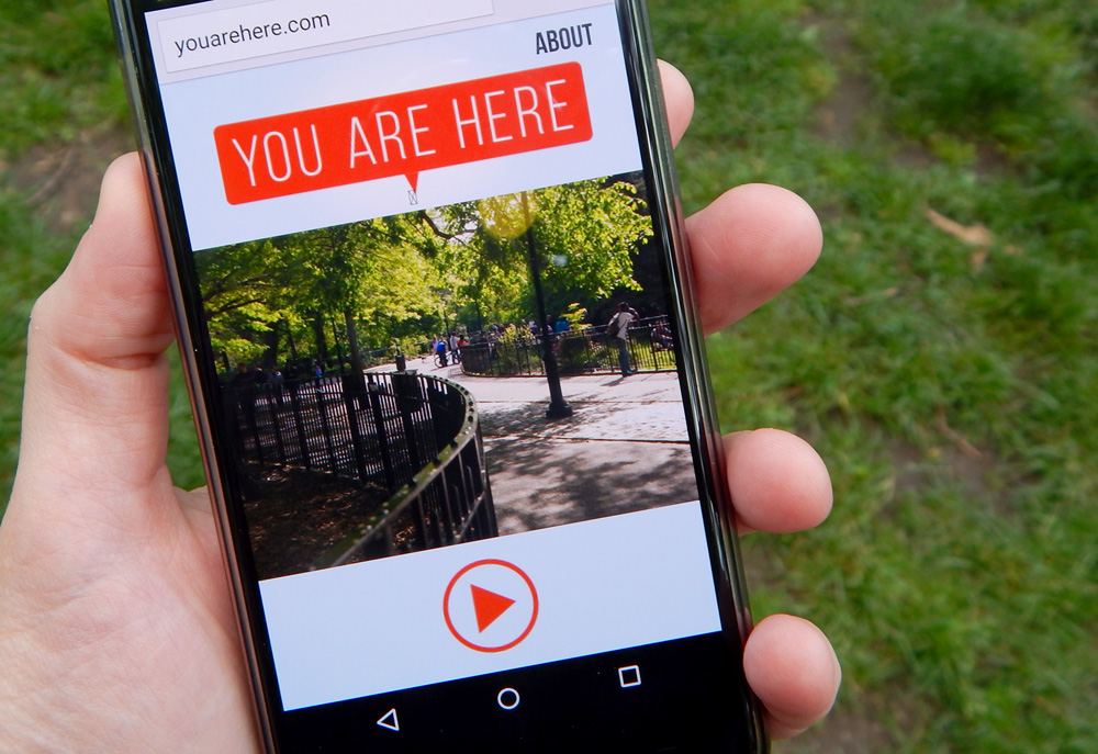
According to artist and designer Amelia Marzec, finding inspiration for You Are Here’s graphic red-orange logo was relatively simple, as she took inspiration from common design conventions in wayfinding and comics.
0.45 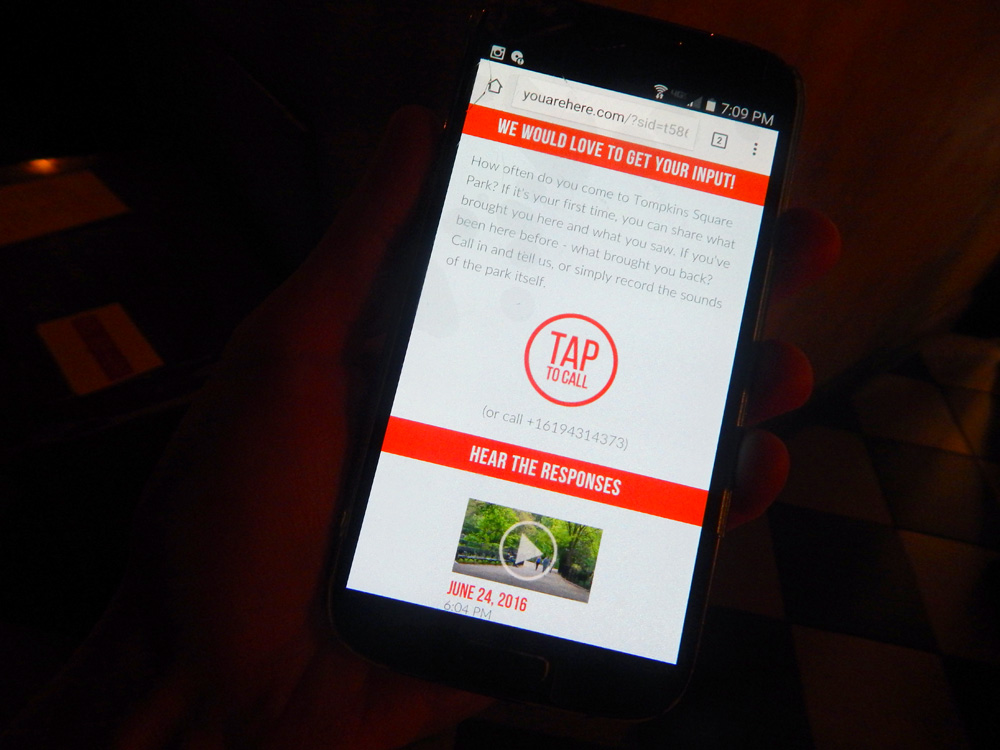
According to artist and designer Amelia Marzec, finding inspiration for You Are Here’s graphic red-orange logo was relatively simple, as she took inspiration from common design conventions in wayfinding and comics.
According to artist and designer Amelia Marzec, finding inspiration for You Are Here’s graphic, red-orange logo was relatively simple, as she borrowed from common wayfinding and comic conventions.
“I was looking at the subway map and they have the little ‘You Are Here’ circle,” says Marzec. “And that’s really common.”
![]()
The You Are Here logo
When it came to the interface, however, things didn’t start out so simple. “We had a lot more screens initially,” she says.
As is often the case, the many screens represented in the early designs for You Are Here reflected our debates about what the system itself would be, and how it would be used. Part of what excited us about You Are Here was the flexibility of the system: offline wireless nodes could be used to foster and create all kinds of communities and conversations. In schools, for example, where safety considerations make traditional online conversations too risky, You Are Here nodes could be used to host message boards or important notices. Alternatively, neighborhoods wanting to ensure the integrity of local conversation could gather input from residents while minimizing onerous security processes.
Our experience in designing and implementing You Are Here therefore exemplified one of the essential tensions of building any technology: While its flexibility can be exciting, its effectiveness comes from its specificity. As Marzec explains, “We’re approaching it as a system that could be used for anything. And that’s something that’s really interesting for engineers, but…people really need something human to latch onto.”
Getting those specifics right, of course, requires a negotiation between the goals of the project and the possibilities and the constraints of the technology.
In the case of You Are Here, our primary goal was to engage readers by telling journalistic, site-specific stories that listeners across the technology-adoption curve could access and contribute to. This led us away from a fully offline solution, and toward one that incorporated some web-based technologies. Similarly, our desire to keep the project physically small (the physical You Are Here unit was approximately eight inches by five inches by four inches with a two-foot antenna) as well as fully open-source influenced the amount of content that we could effectively store on the physical device.
This meant that some of our early ideas for the You Are Here nodes simply weren’t feasible. Yet these constraints were also what ultimately allowed us to streamline the interface and user experience into one simple, accessible web page, saving us from the “feature creep” that might have overloaded the interface to make it clunky and cumbersome. In other words, designing the You Are Here interface helped us both define and refine our goals for the overall project, an aspect of the design process whose value is gaining currency in both creative and journalistic settings. As Heather Chaplin, director of the Journalism + Design program at The New School wrote for the Tow Center in 2016:
Design is the creation of new solutions to a problem, and there is no guarantee that it is the right solution in the scientific or logical sense. It’s always going to be one of many possible solutions. Its rightness is determined by whether it solves the problem.
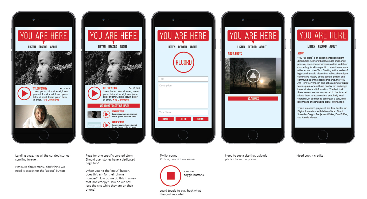
Early concepts for the You Are Here interface. Originally, we imagined users would provide a title and description of their recorded response, in addition to optionally uploading photos. This solution, however, would have required that all contributors have very recent smartphones and our goal was to reach a broad audience of listeners and contributors, including those with older or feature-only phones. As a result, our final interface has only three functions: “Listen,” “Tap to Call” (with a telephone-number alternative), and the option to listen to others’ responses.
Of course, meeting some of our functionality requirements did mean compromising on others. For example, because contributors were calling a phone-based service to share their stories, there was no straightforward way for them to give their story either a title or a description. This meant that when it came time to display these stories in the You Are Here interface, there was little information available to give readers about what they might contain.
“We just have this generic date,” says Marzec. “It would be good to know what people are going to click on…Like, ‘This is a story about my grandmother growing up in this neighborhood.’”
Ultimately, the streamlined interface for You Are Here nodes helped focus the purpose of the project for users: to listen to others’ stories and share your own. While future versions of the You Are Here nodes might focus on other objectives, our on-site experiments allowed us some insight into how audiences might engage with this unique storytelling experience on a larger scale.