Chartbeat and the Making of Web Analytics
“It’s not the identity of the number [that matters]. It’s the feeling that the number produces …That’s the thing that’s important.”
-– Chartbeat employee
Data about audiences has long been a source of distrust—or, at least, indifference—for journalists. Journalism scholars who conducted fieldwork in newsrooms during the pre-Internet era found that print journalists took little interest in audience surveys, circulation data, or even more direct forms of feedback like letters from readers. Rather than write with a statistically informed picture of their audience in mind, instead they often relied on archetypes of a typical audience member—usually a family member—when considering the relevance of a particular story to readership. They also greatly valued the opinions of their colleagues and bosses, trusting them far more than the general public to determine whether a story qualified as good journalism.7 With the advent and spread of the Internet, two things changed. First, the data got much more sophisticated—meaning, it became far more detailed and specific and was available much more quickly. Second, changing structural conditions meant that newsrooms could no longer afford to ignore metrics. As content became more abundant and previously reliable sources of advertising revenue dried up, news organizations faced intensifying financial pressures. One way to win the fierce competition for dwindling ad dollars was to enlarge a publication’s audience, and metrics developed a reputation as a crucial tool for doing just that.
Still, the idea of using metrics to inform editorial decision-making was (and sometimes still is) met with derision, anxiety, and outright hostility by many journalists. In March 2014, the late Times media columnist David Carr warned, “Risks Abound as Reporters Play in Traffic.”8Viral Traffic Hurting Journalism?”9reputation for being extremely metrics-driven have voiced concerns. A BuzzFeed headline read, “Infinite Feedback Will Make Us Crazy”10a Daily Beast piece on the “anti-clickbait movement” was entitled “Saving Us from Ourselves.”11 In this climate, a company determined to get metrics into a wide array of newsrooms had its work cut out for it. But by many measures, Chartbeat has succeeded at doing just that. As CEO Tony Haile often points out, the company works with 80 percent of the highest-trafficked publishers in the United States, as well as newsrooms in 35 other countries. This makes Chartbeat an intriguing research site for examining the production of analytics. How does Chartbeat decide what to count and how to present data? And just as important, how does Chartbeat market and sell its product to newsrooms?
The answers I uncovered during my research add complexity to the way we typically think about what metrics are and the function they serve within news organizations. In both popular and academic discourse, there is a widespread tendency to think of metrics as instruments of rationalization—as tools that systematically and scientifically measure the performance of news content and convey that information to journalists so that they can draw more traffic to their sites. Chartbeat often portrays its mission this way: the company’s website boasts that its dashboard allows clients to “see what interests visitors and adapt your site instantly,” “equip your team with decision-driving data,” and “know what content sparks and holds readers’ attention.” The client testimonials on Chartbeat’s site also employ dry, technical language. Here is Gawker’s: “By providing key information in real time, we have a more precise understanding of the traffic we must support as we add features to our next-generation live blog platform.” The prevailing message is that the dashboard exists to communicate rational, dispassionate data, upon which journalists can then act.
And indeed, Chartbeat’s analytics tool is designed to communicate data. The dashboard’s original distinguishing feature was its real-time information about visitors’ behavior (the name Chartbeat is a play on heartbeat, evoking this immediacy). The current publishing dashboard (Fig. 1) is packed with data about readers’ behavior. In a quick glance, one can see how many visitors are on the site (and on each particular page) at a given moment; the average amount of time they have been there; which Internet sites referred them; how often they visit; where in the world they are located; what percentage of them is looking at the site on mobile phones; and much more.
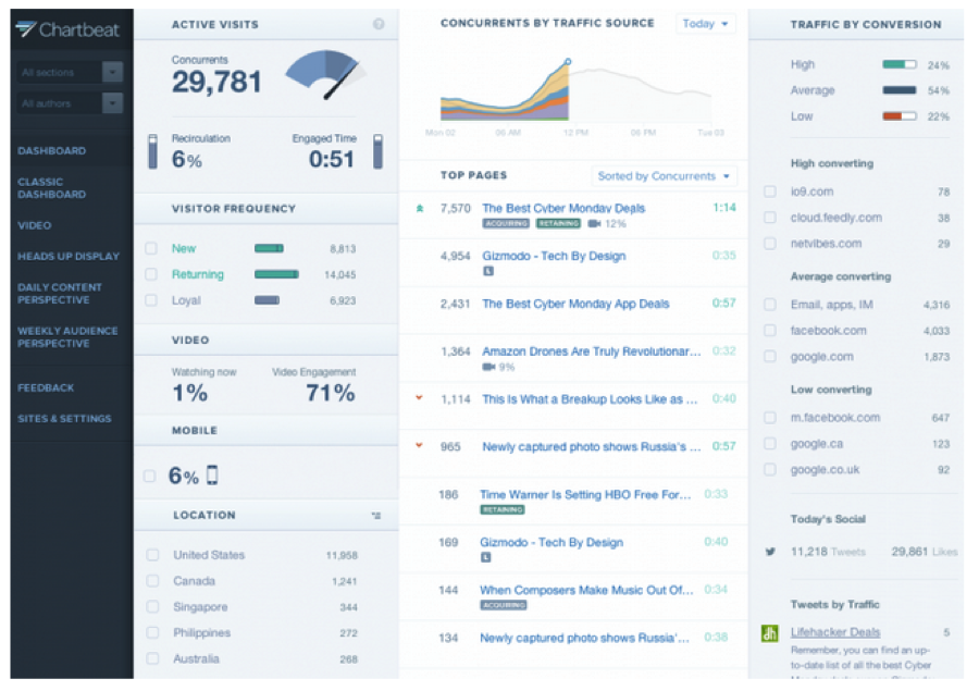 Fig. 1: A screenshot of Chartbeat’s dashboard for publishers.
But a closer look at the dashboard, coupled with hours of observation and interviews with the people who dreamt up, built, and marketed it, reveals that providing rigorous data is only a part—and at times not even the most important part—of what the dashboard is designed to do. For Chartbeat to succeed, its product must appeal to the journalists whom are its intended audience. To accomplish that, the dashboard must do much more than merely communicate data. It must demonstrate deference for traditional journalistic values and judgment; it must be compelling; it must soften the blow of bad news; and finally, it must facilitate optimism and the celebration of good news. None of these things fall under our conventional understanding of what an analytics tool is and does, yet Chartbeat expends considerable energy and effort on them. Some of these aims can be accomplished within the actual dashboard; others, like demonstrating respect for traditional journalistic judgment, are accomplished both within the dashboard itself and in Chartbeat staff’s interactions with clients.